
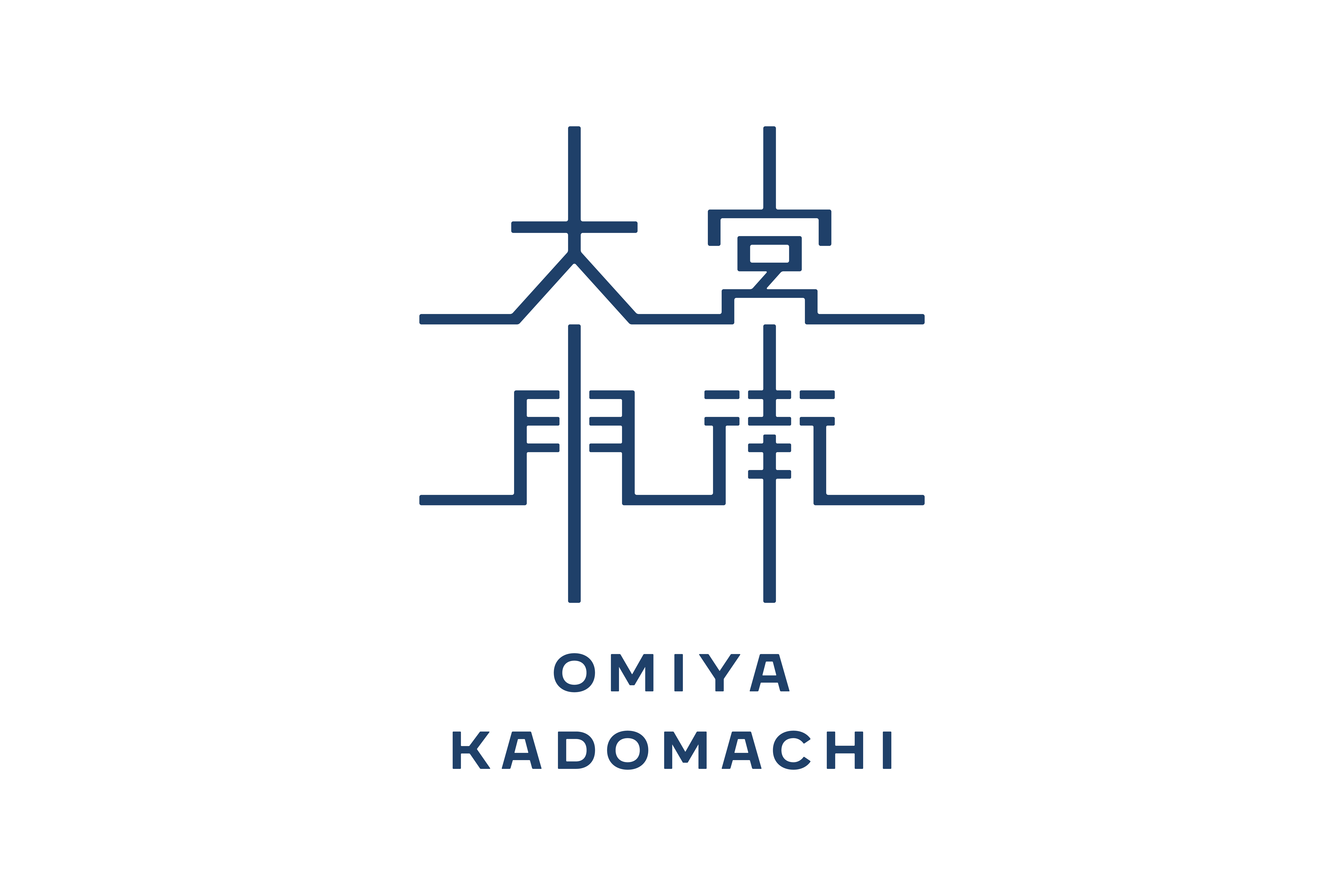
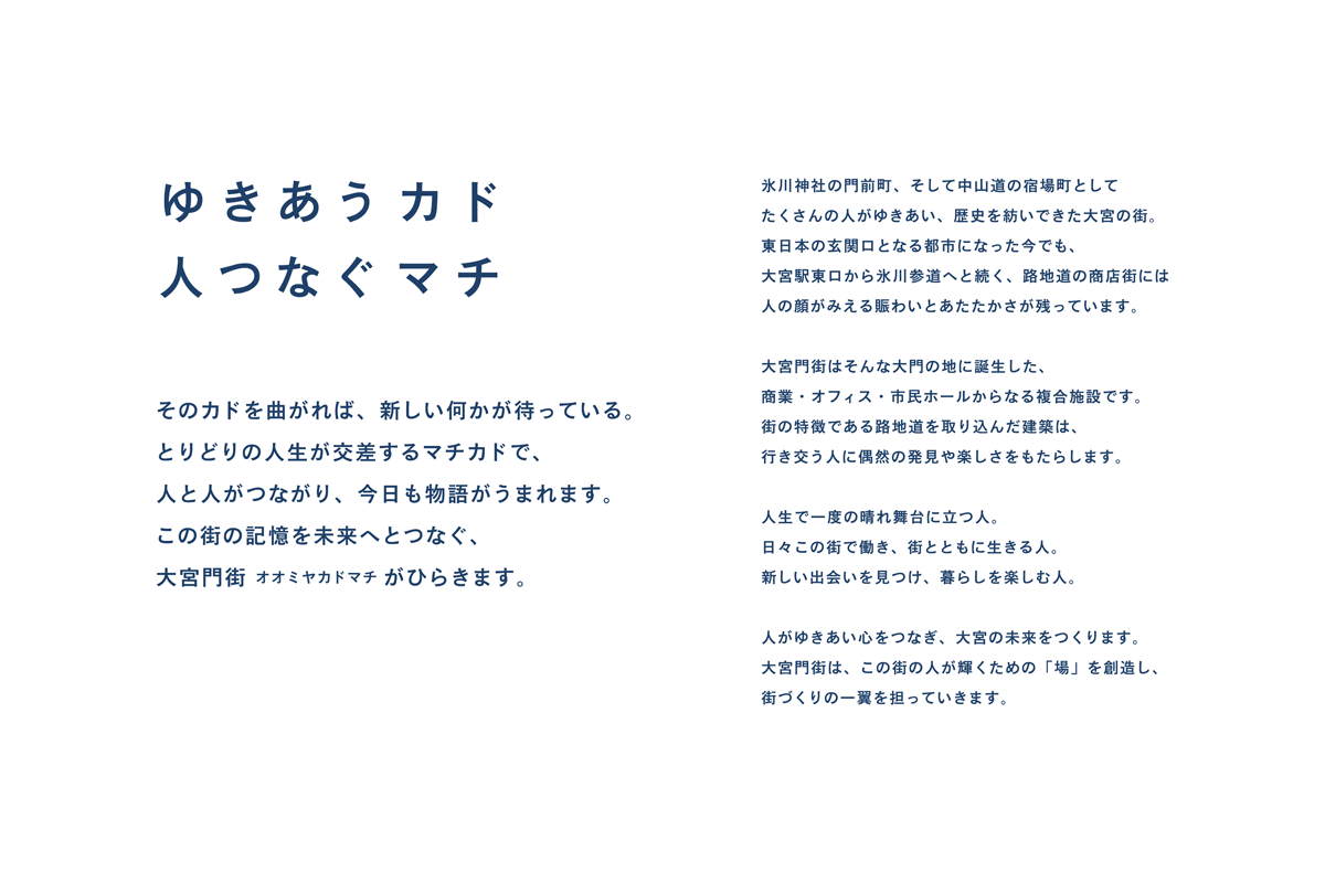
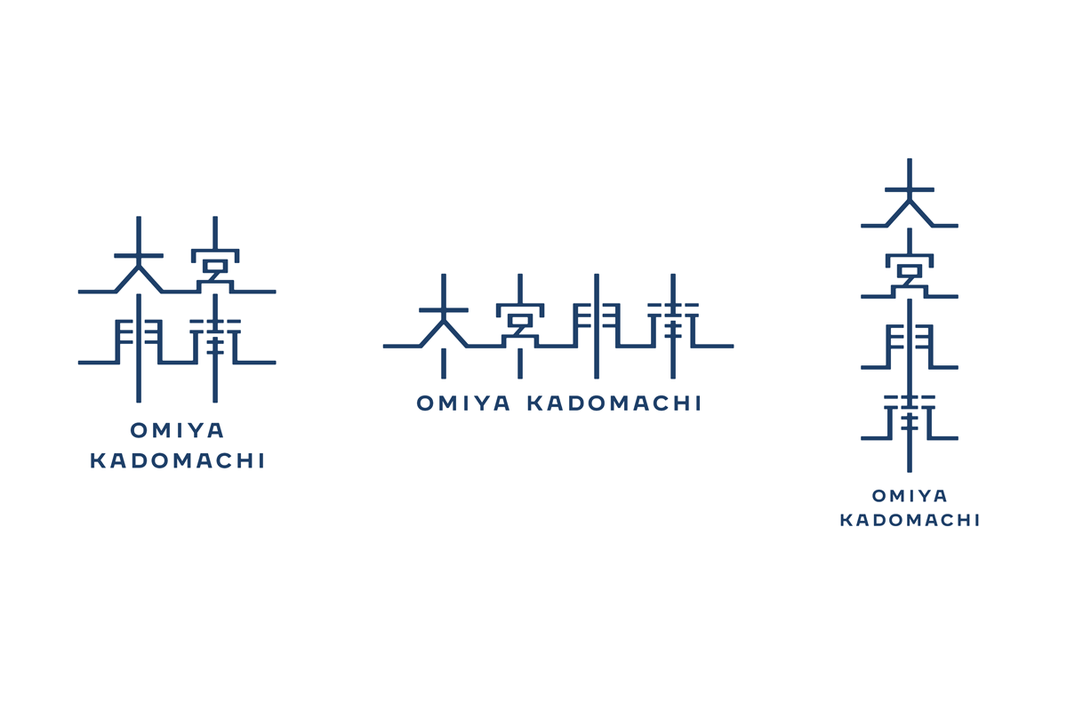
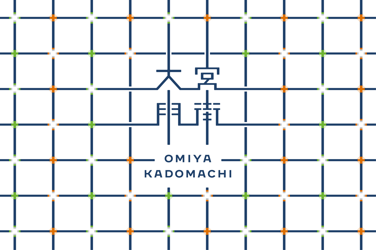
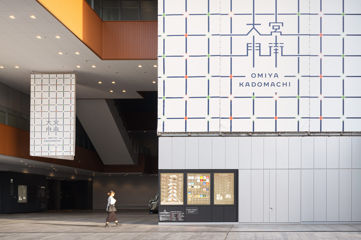
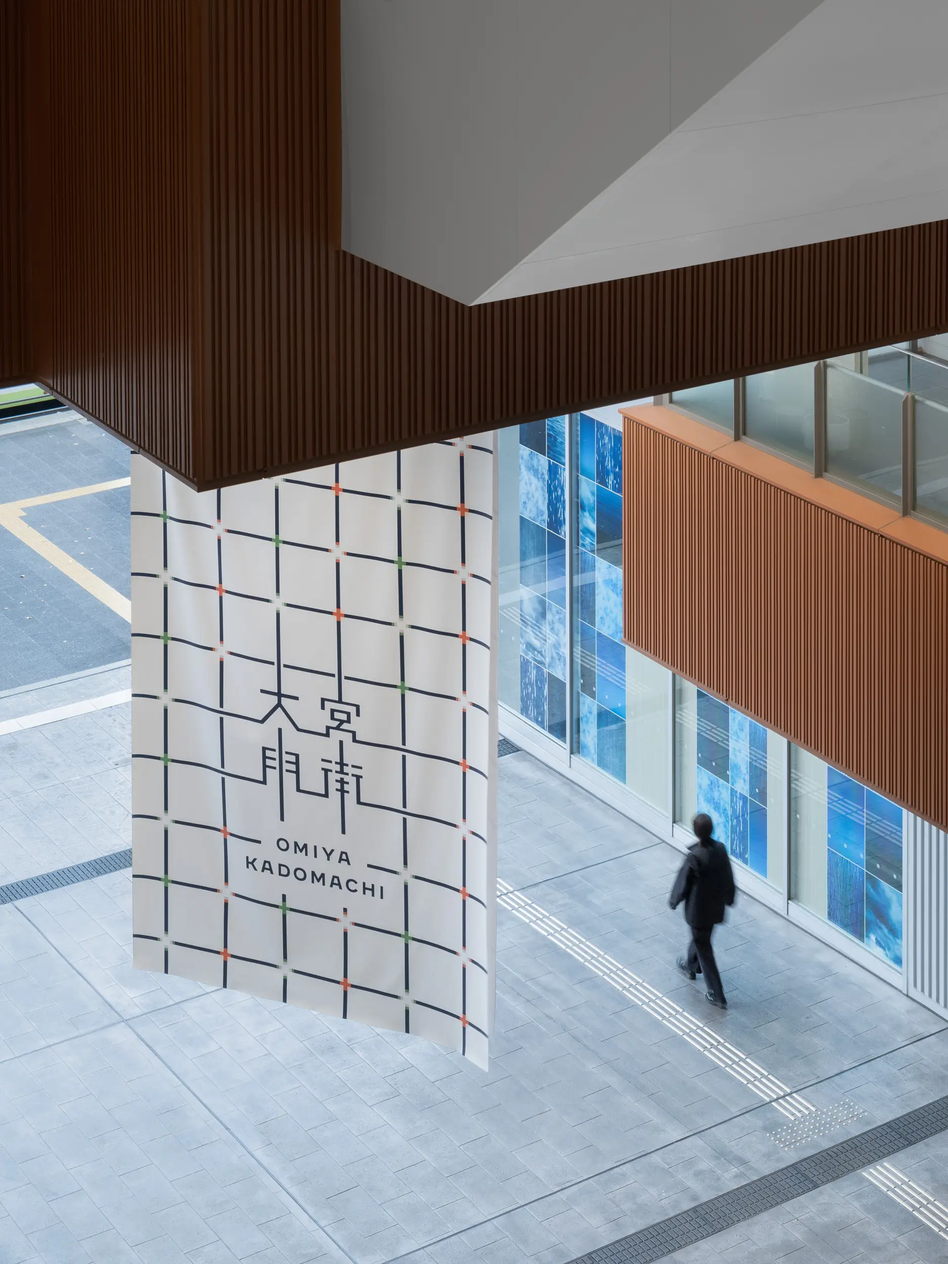
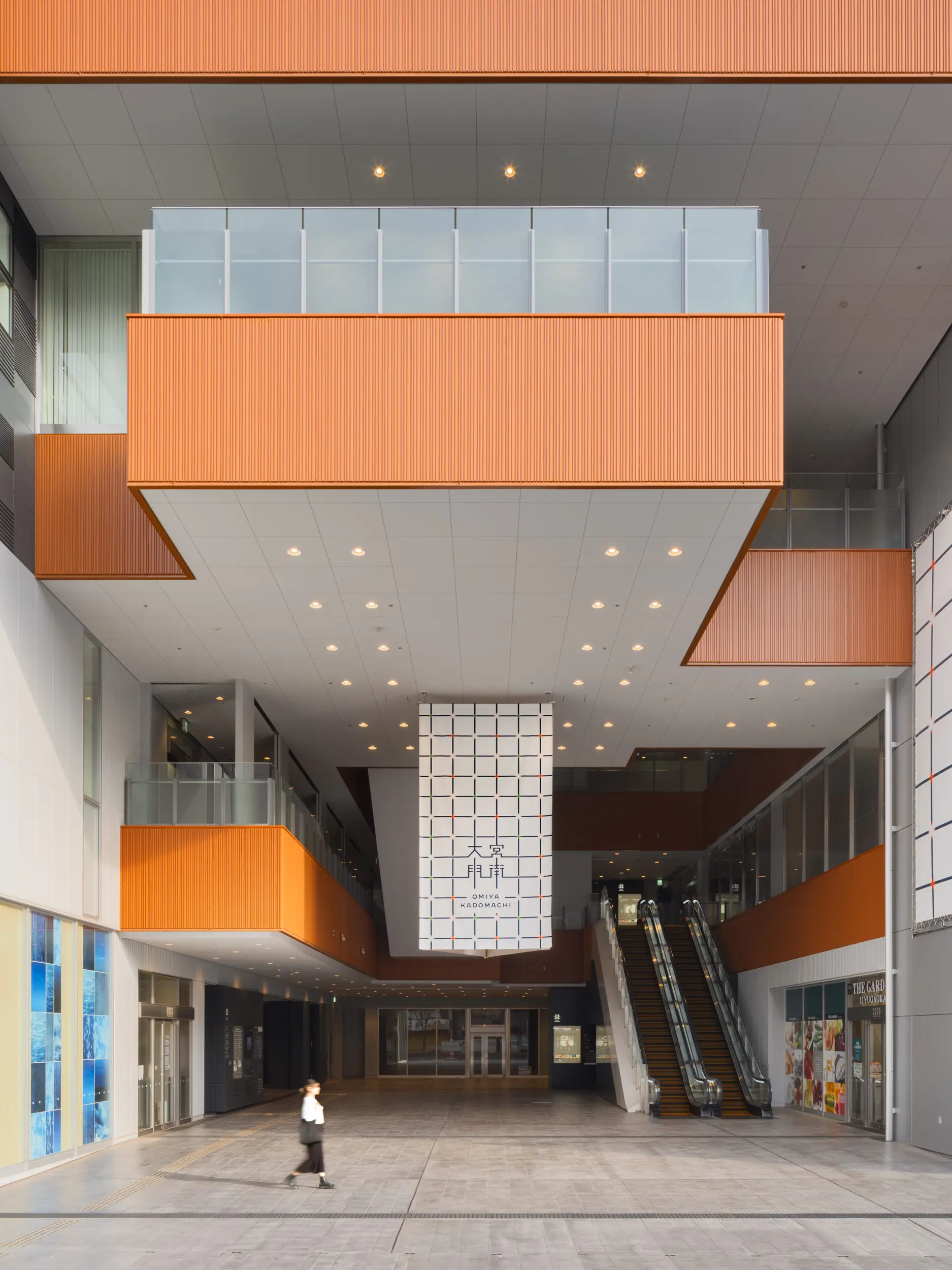
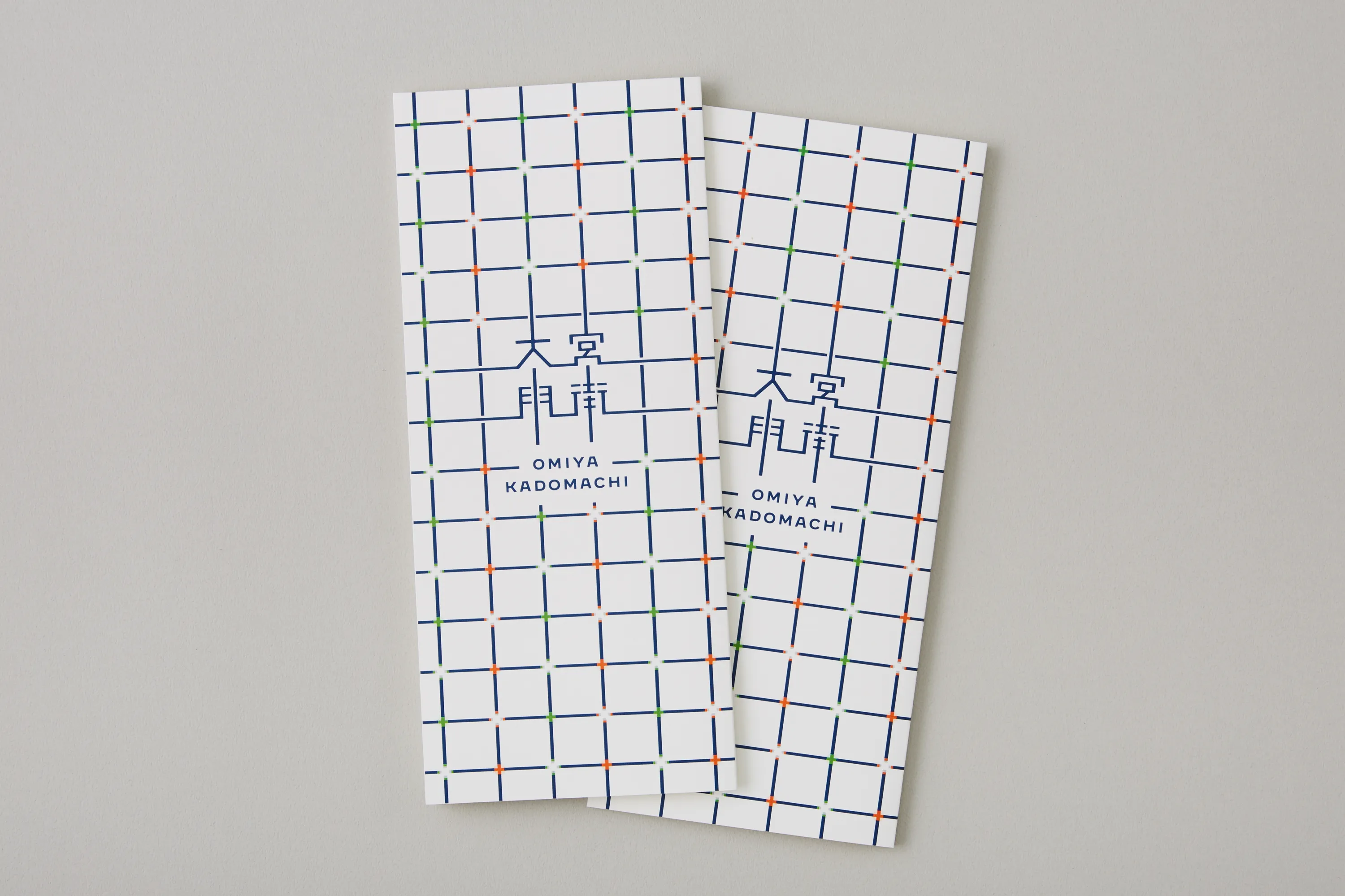
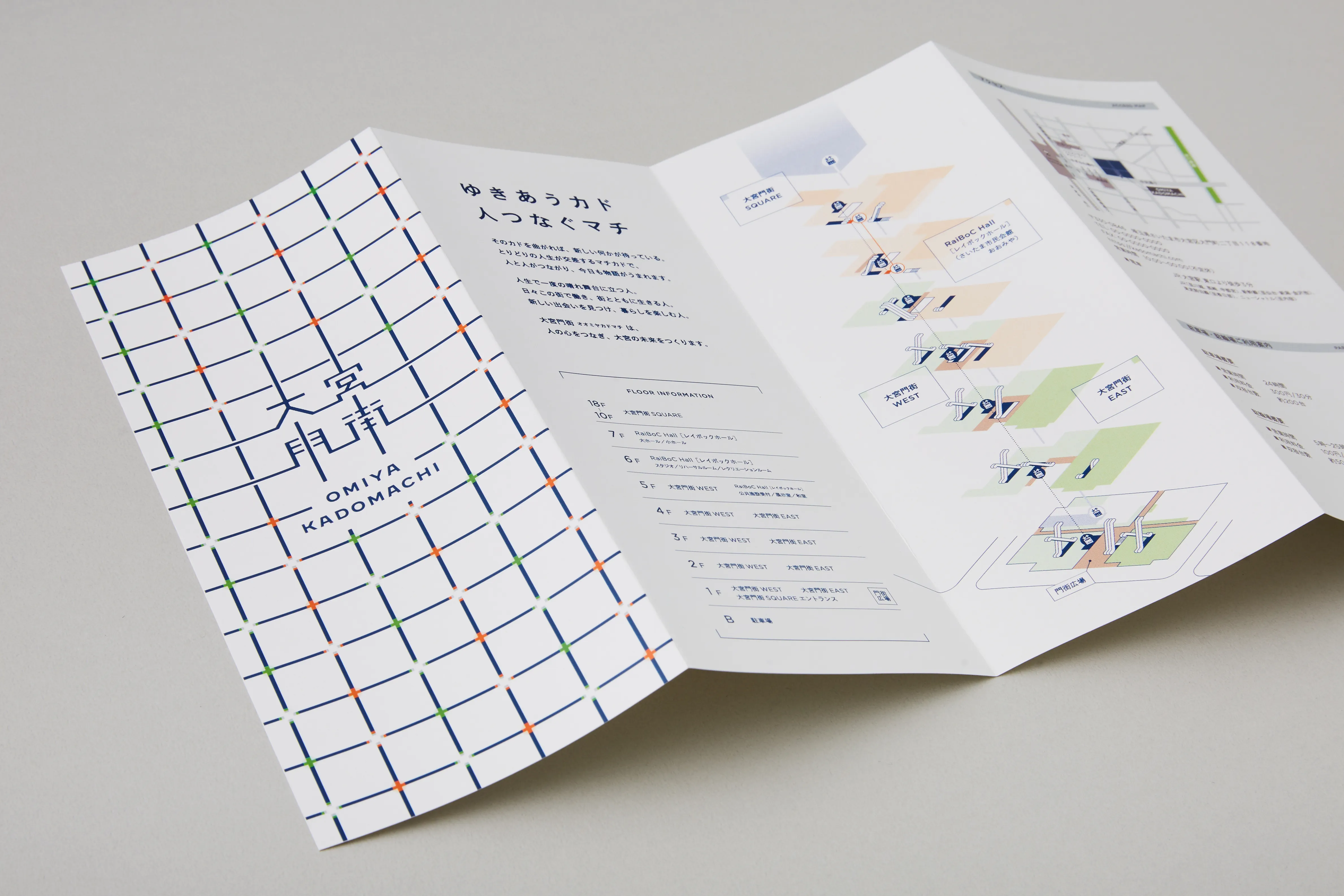
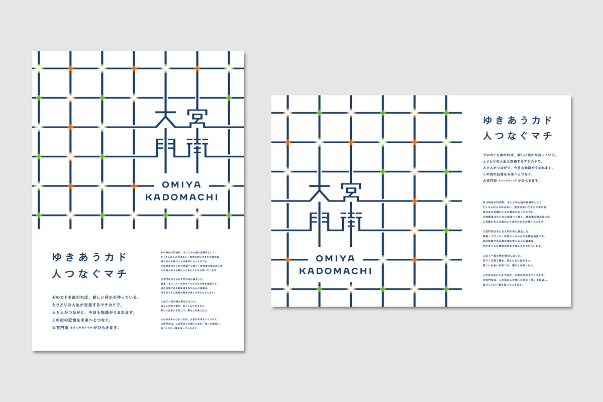
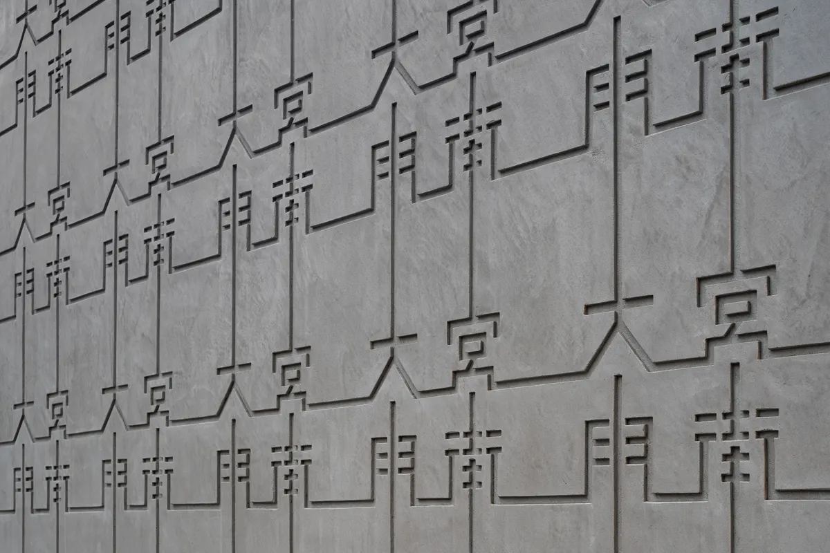
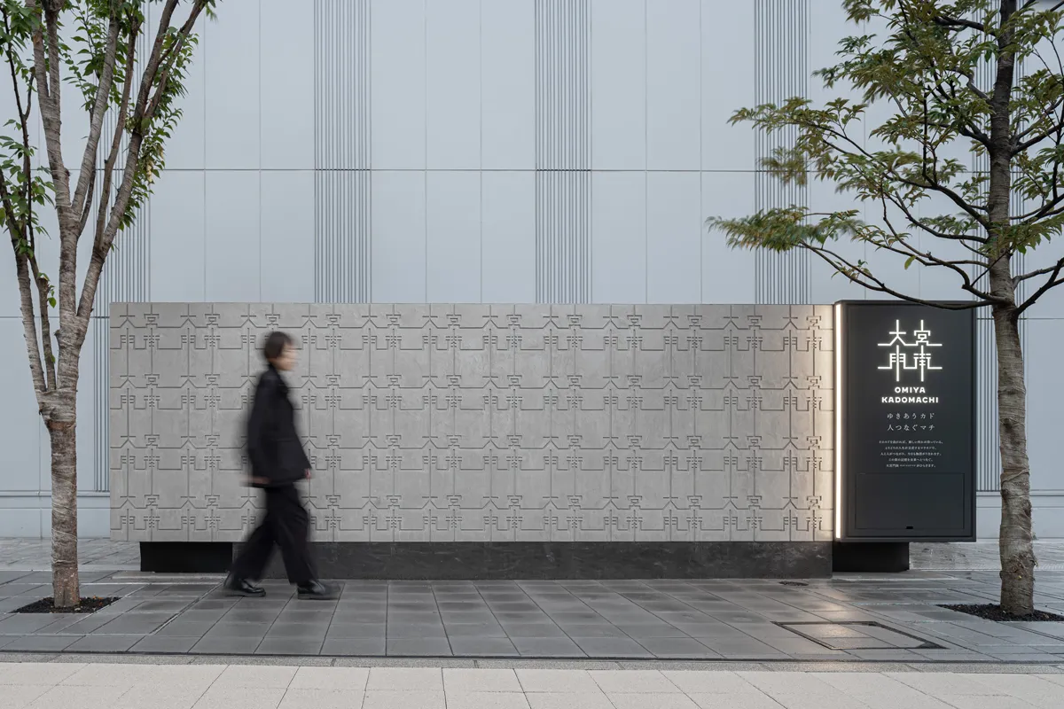
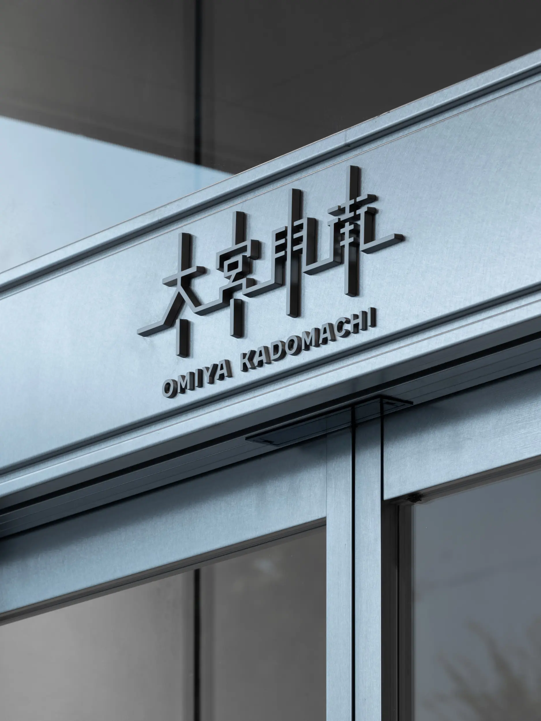
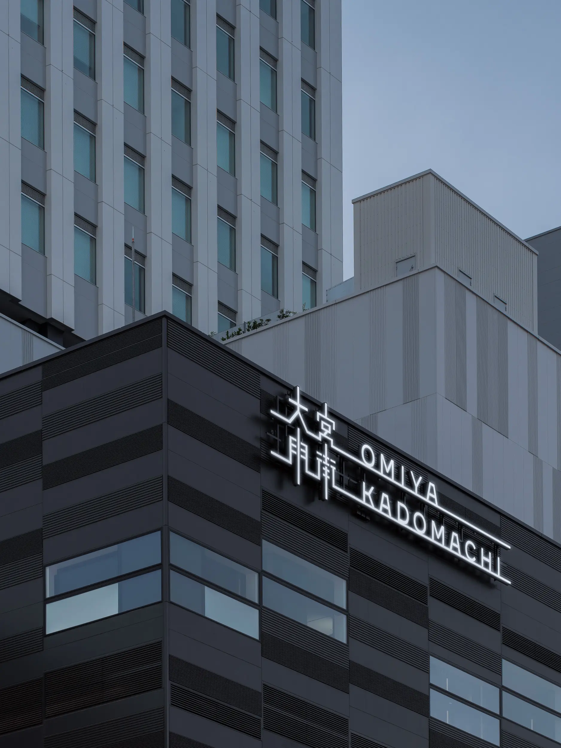
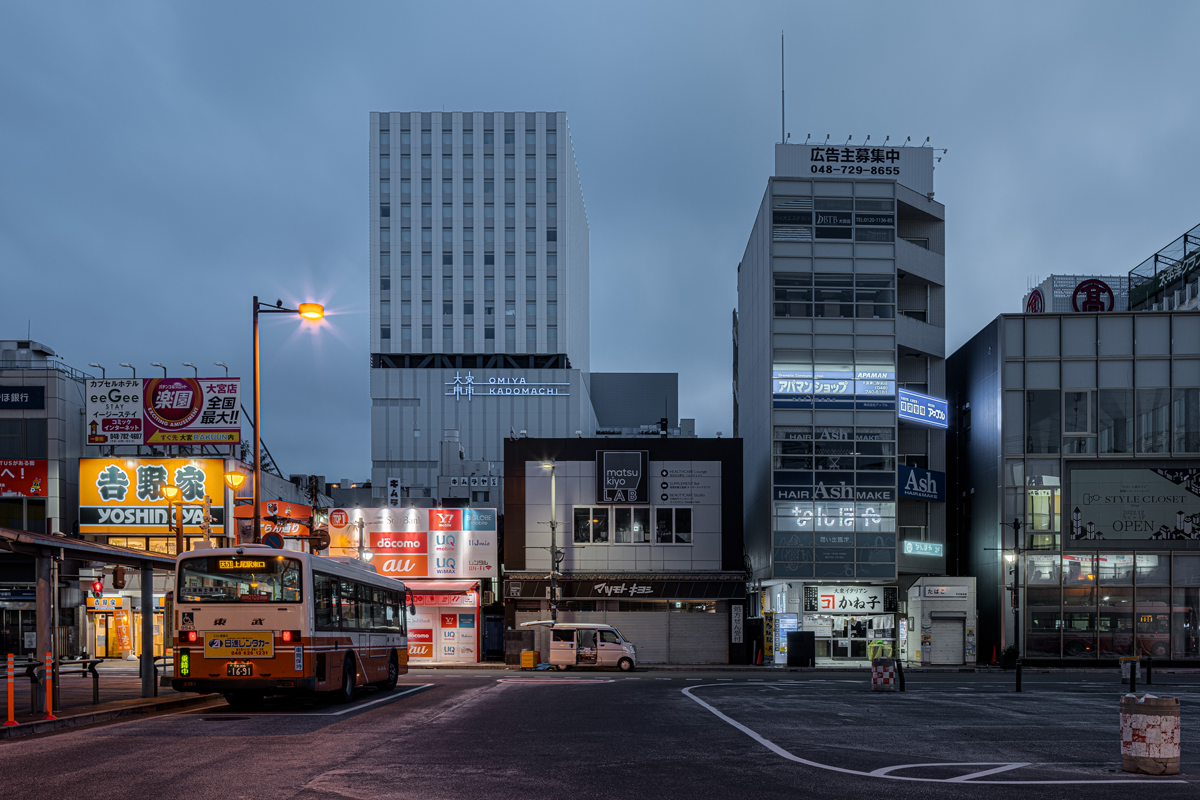
“東日本の玄関口”と呼ばれるさいたま市大宮駅で、長期にわたり進められてきた東口エリアの再開発事業。商業、オフィス、市民ホールからなる複合施設が、大宮の新しいアイコンとなり市民に親しまれる場所になるよう、コンセプト開発、ネーミング、ロゴデザイン、キーグラフィック開発とファサードサイン等のブランディングデザインを行いました。 氷川神社の門前町、また中山道の宿場町として発展してきた大門の地に建つ大宮門街。ネーミングと漢字のロゴには「横に読むと大宮、縦に読むと大門」と二つの地名を組み込み、土地の歴史を未来へ引継ぐという意味を込めました。 縦横のラインが文字とつながり十字に交差したシンボルマークは、大宮の街の特徴であり建築のコンセプトでもある「路地道」を視覚的に表現したものです。そこから発展した格子柄のキーグラフィックを展開することで、マチカドでゆきあう人と人がつながり、街のあちこちで物語が生まれることを表しました。
Omiya Station in Saitama City is called the “Gateway to Eastern Japan”. A redevelopment project of the east side of the station has been underway for a long time. We developed the concept, naming, logo design, key graphics, facade signage, and branding design for this new complex of retail, office, and civic hall facilities. Our goal was to make this facility a new icon of Omiya and a familiar place for the citizens. The name and logo in Chinese characters can be read horizontally as “Omiya” and vertically as “Daimon”. By incorporating the two place names that represent the history of the land, the logo is meant to pass on the history of the land to the future. The symbol mark, with its intersecting vertical and horizontal lines, is a visual representation of the character of the city. The key graphic of the plaid pattern that developed from this symbol mark represents the meeting of people on the street corner and the birth of a new story.
Year : 2022
Category : Branding (Concept, Naming, Logo, Signage, Leaflet)
Client : 大宮駅東口大門町2丁目中地区市街地再開発組合
Produce : 株式会社日展
Architect : 株式会社山下設計
PR : 株式会社中央デパート | STUDIO SAITAMA LLC