
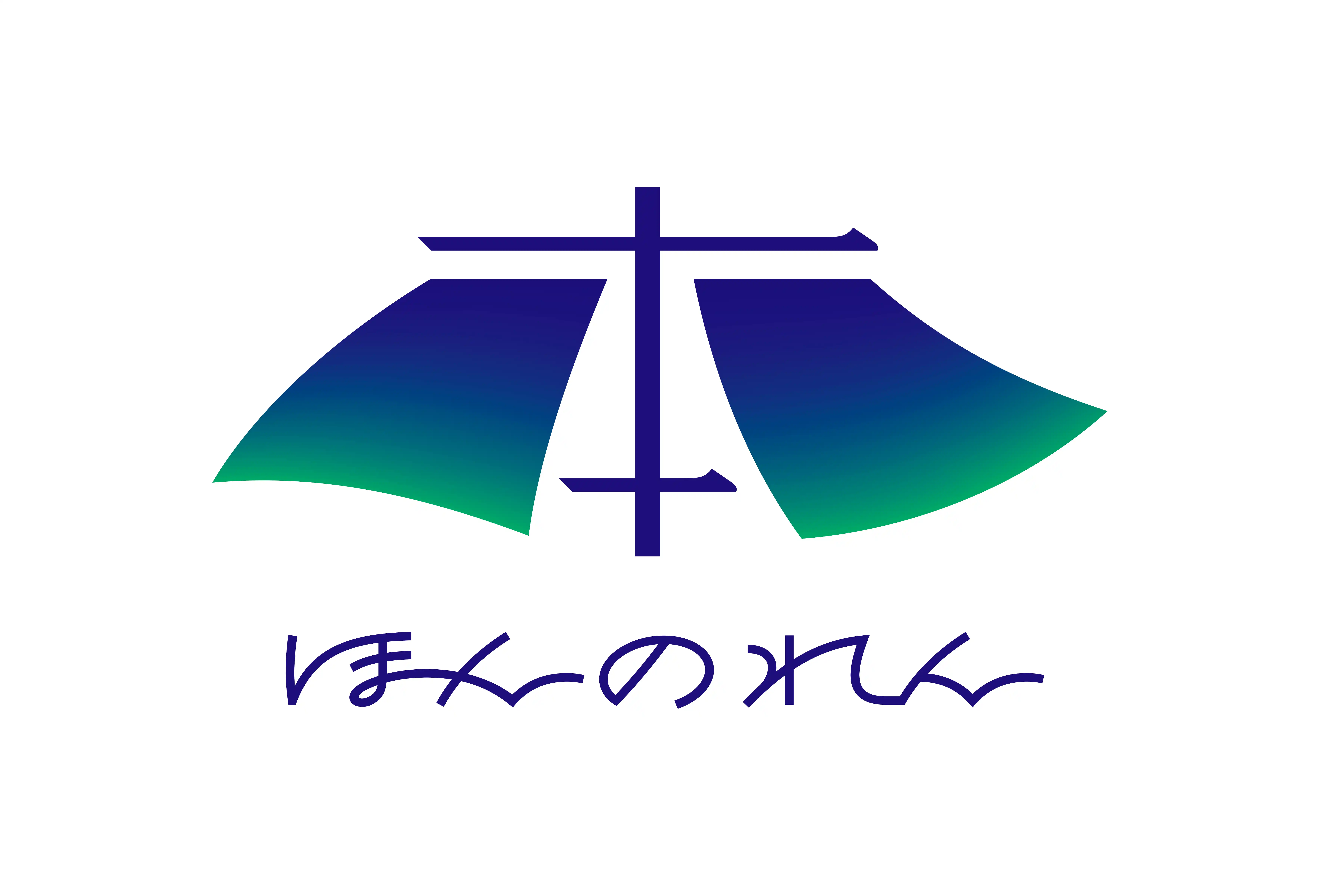
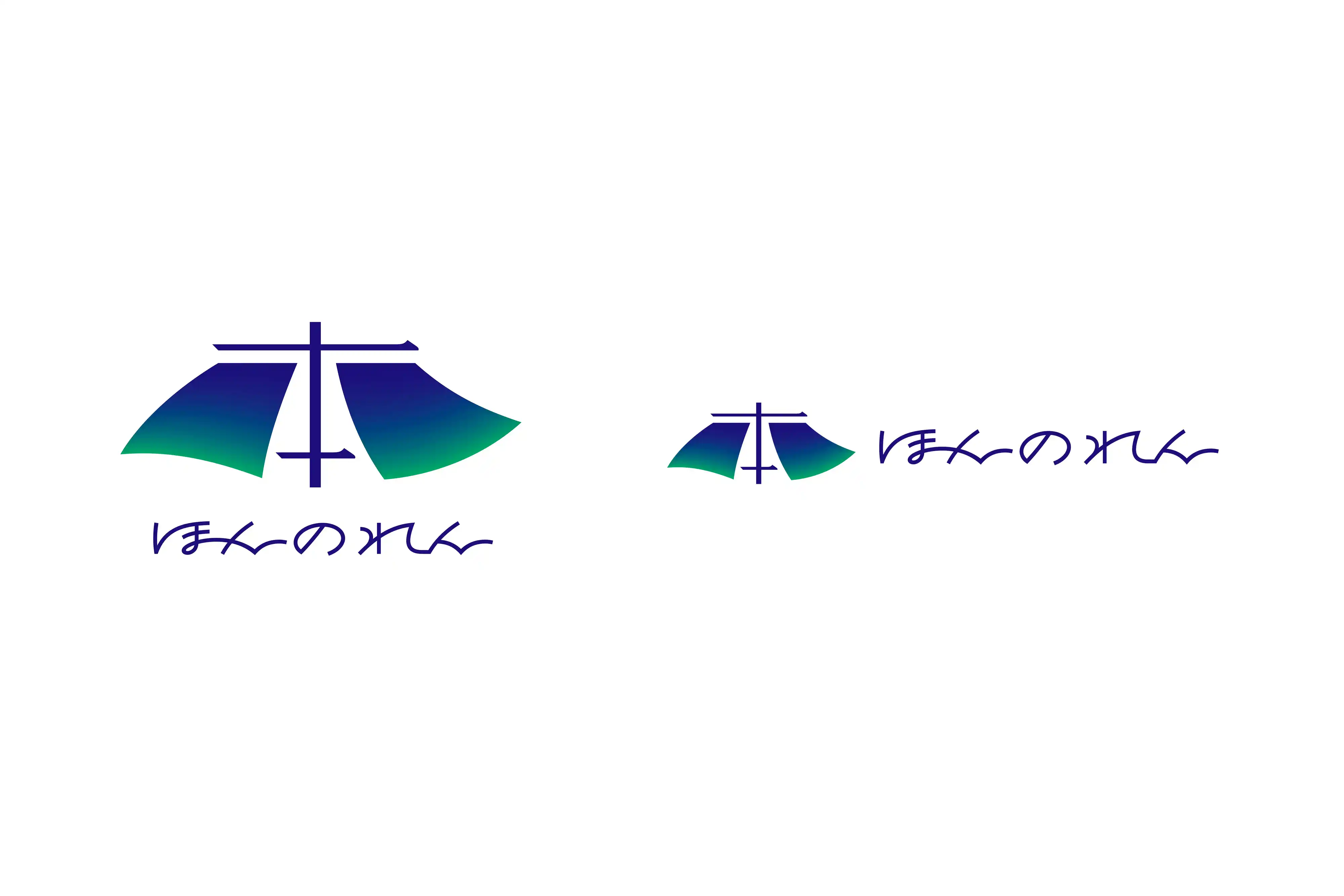
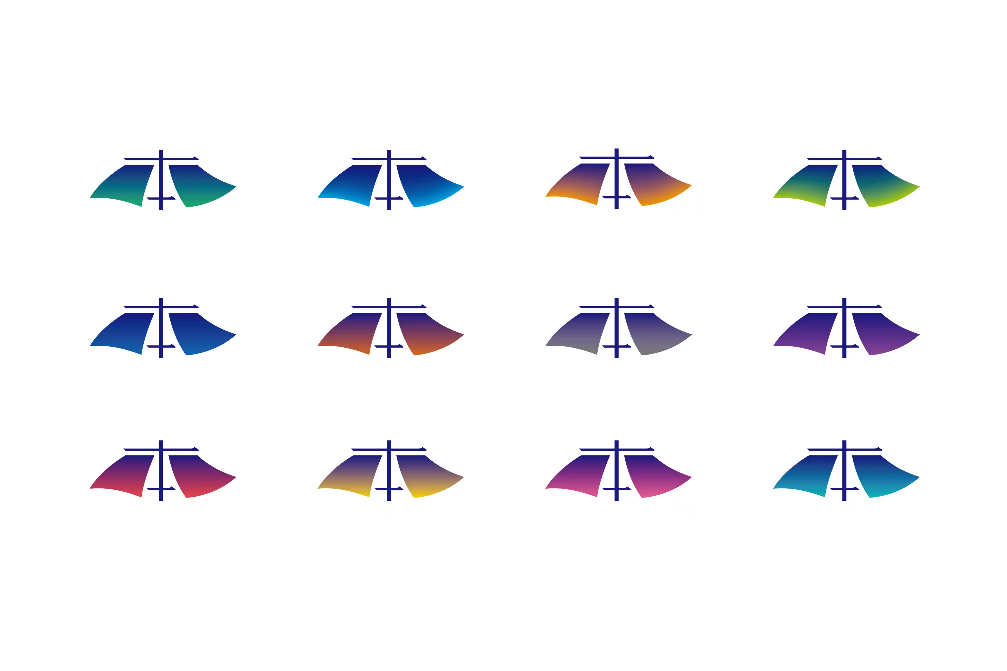
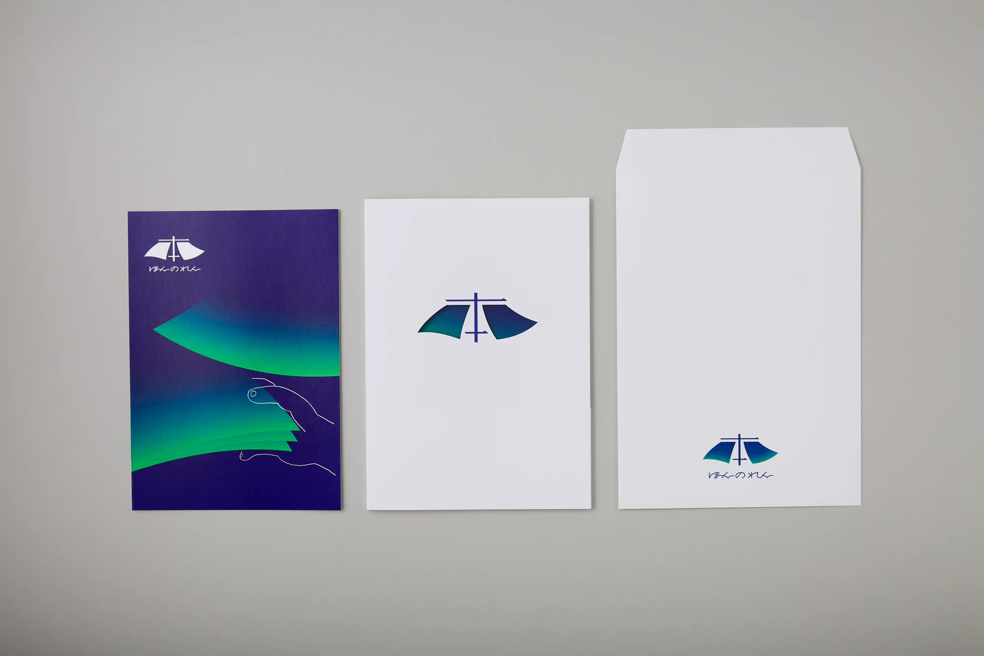
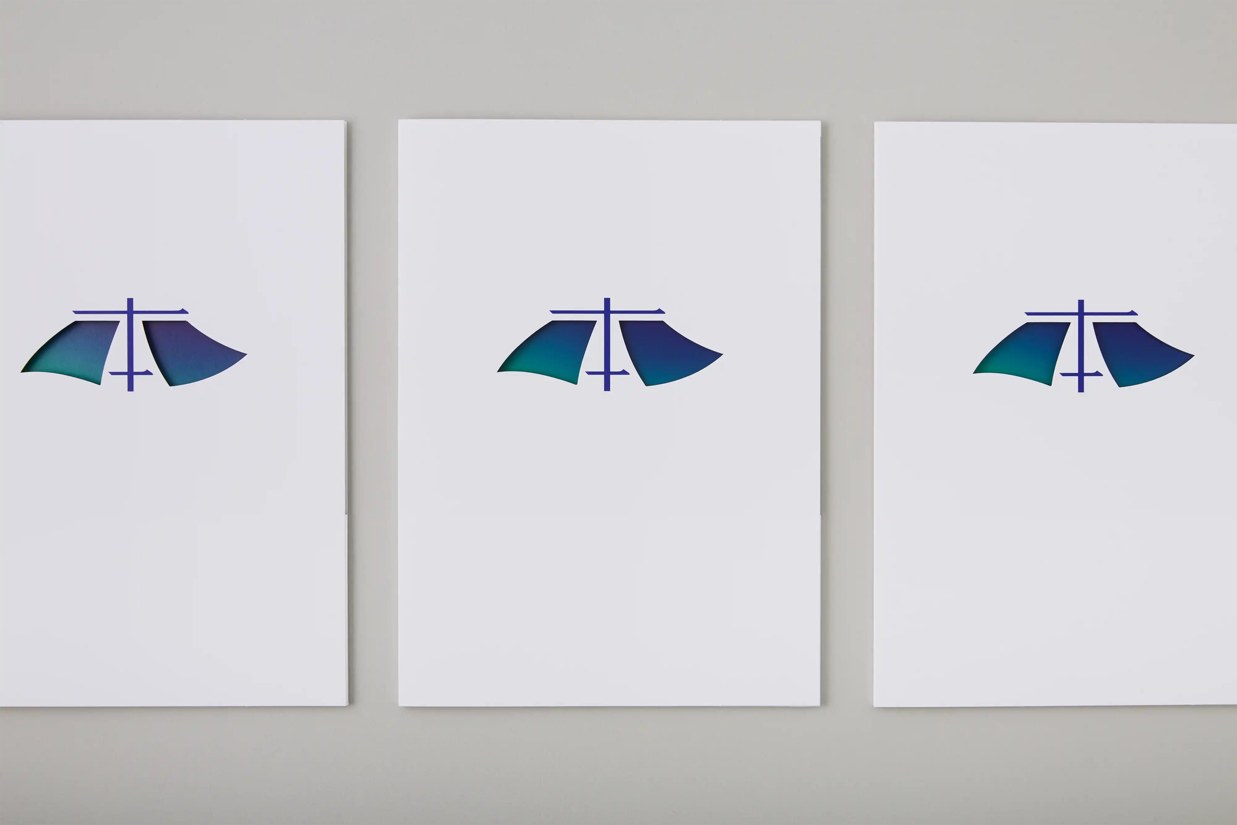
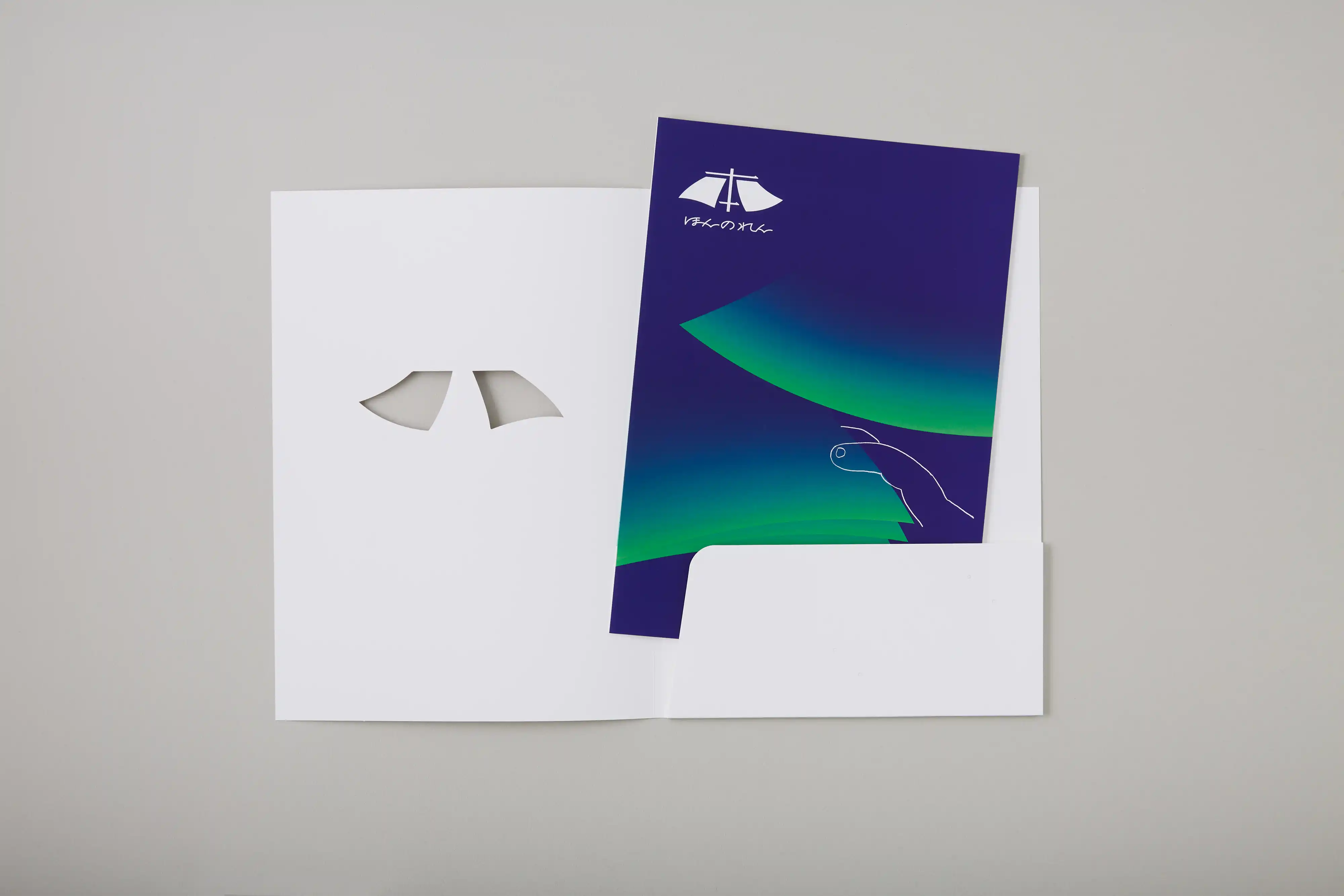
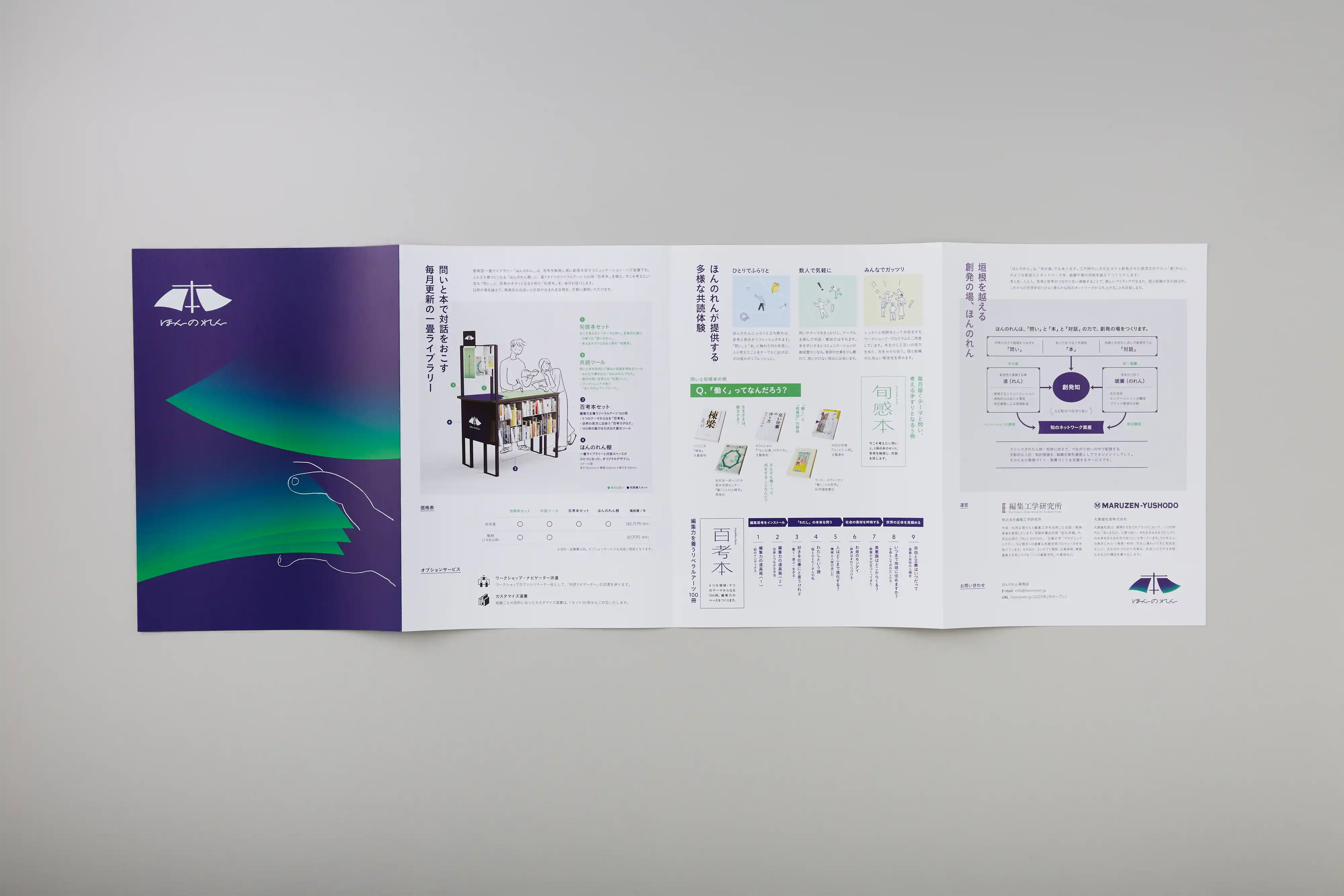
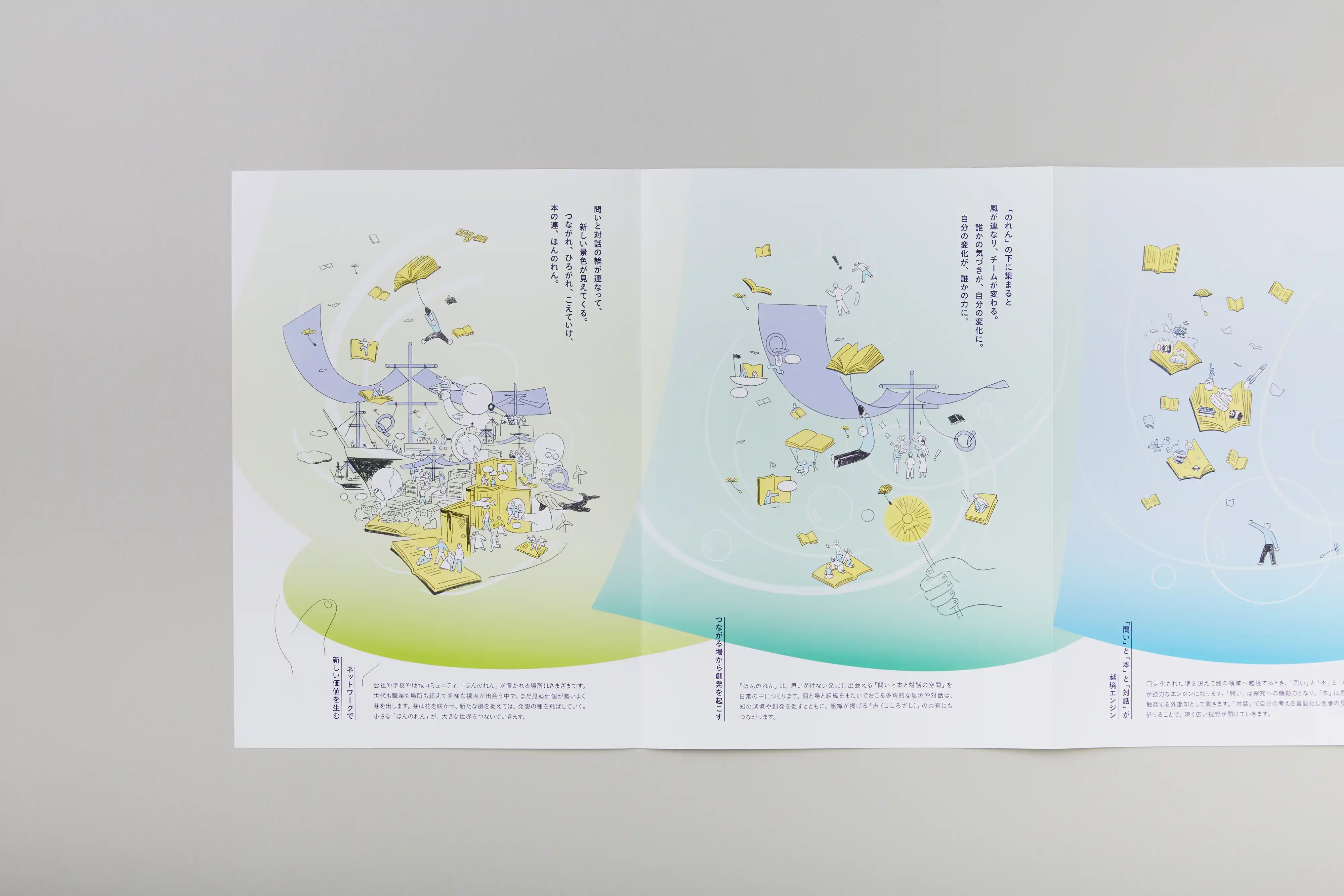
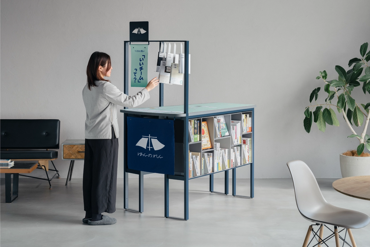
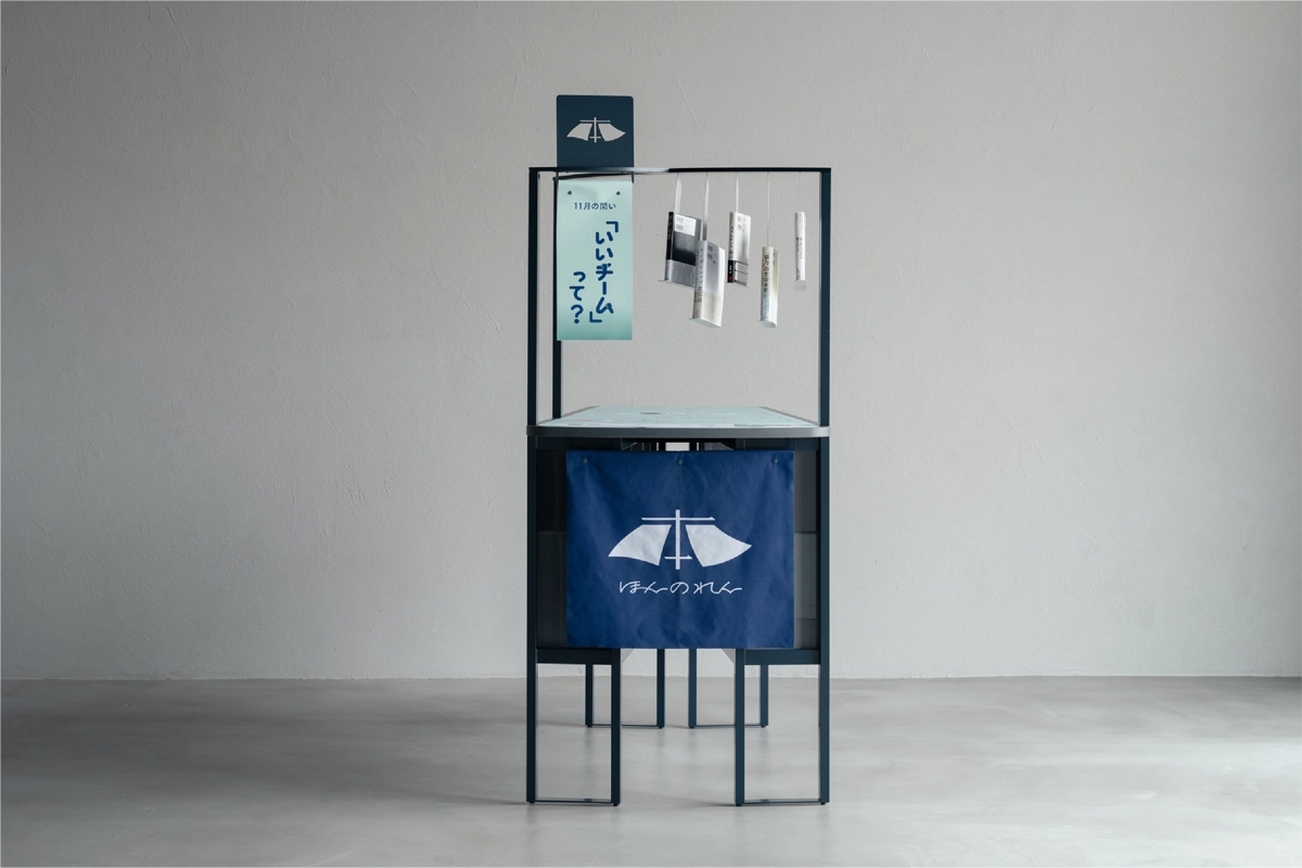
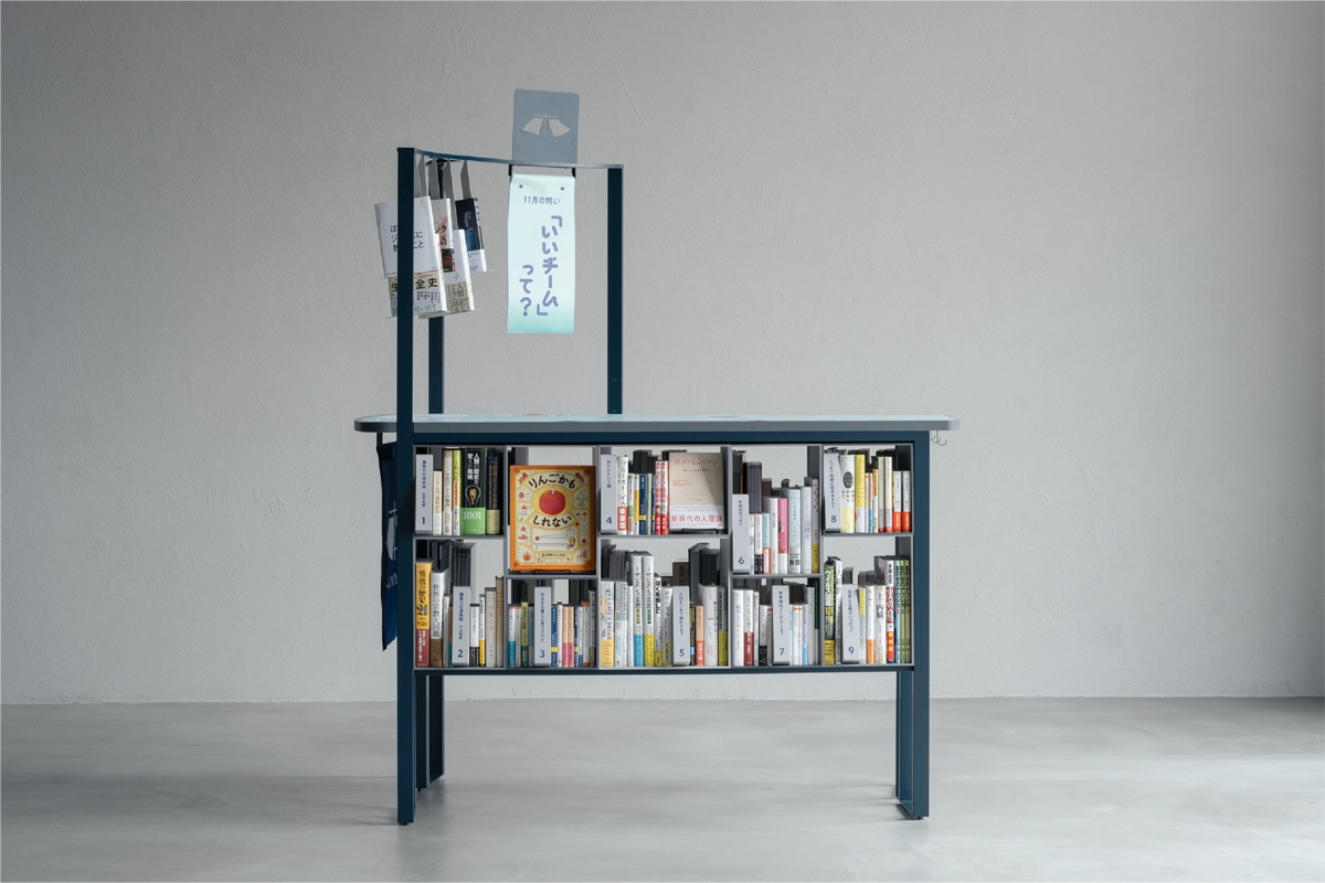
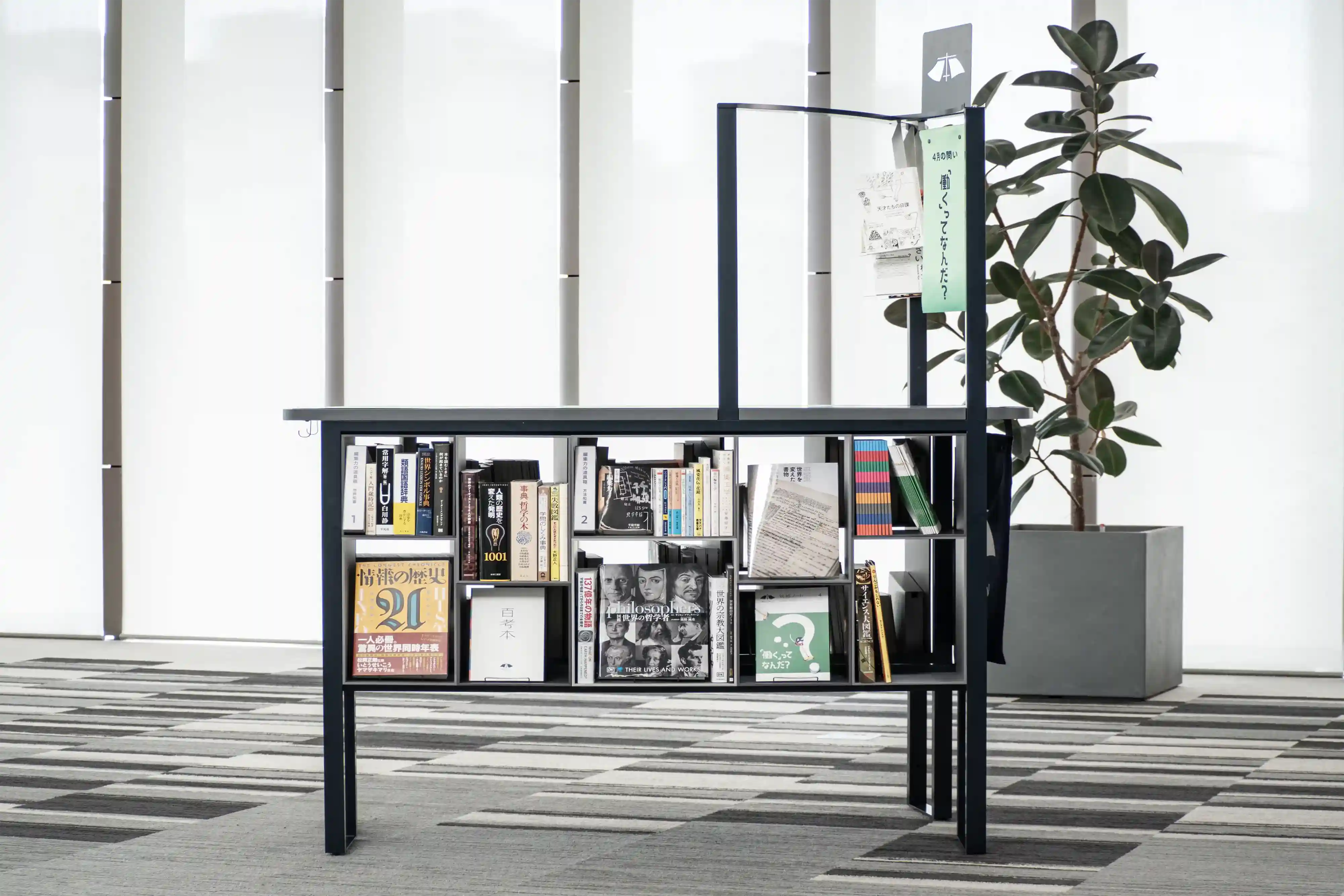
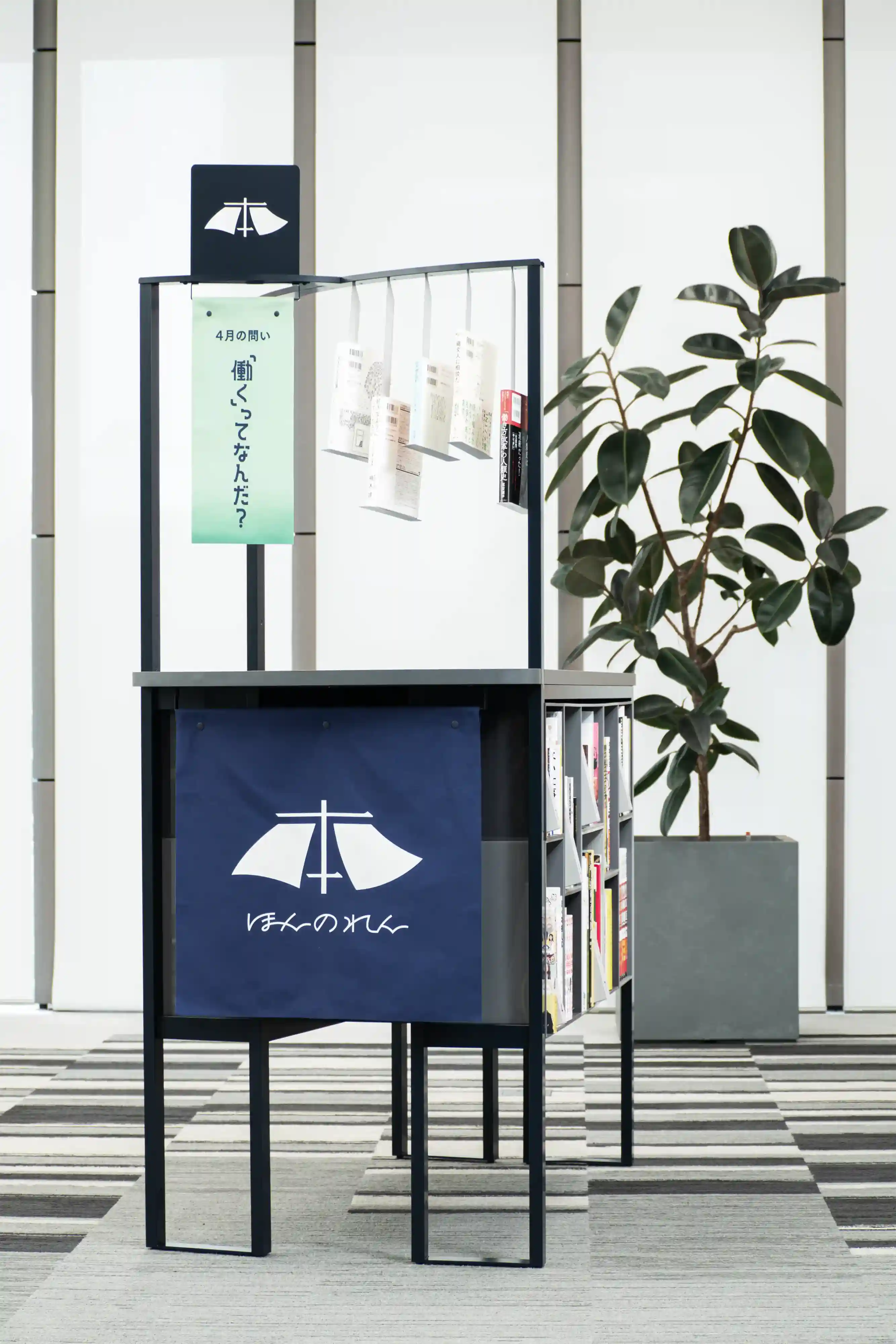
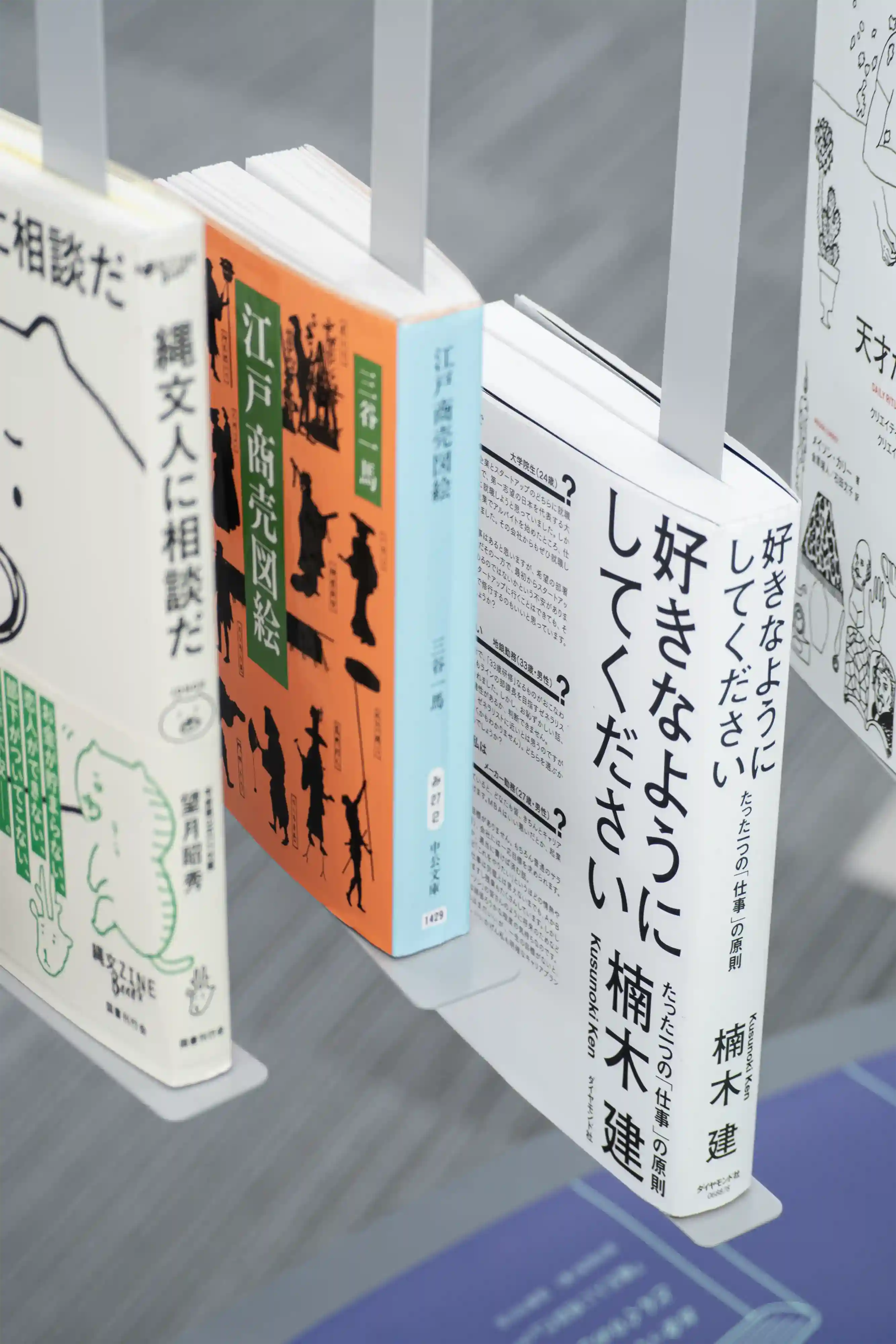
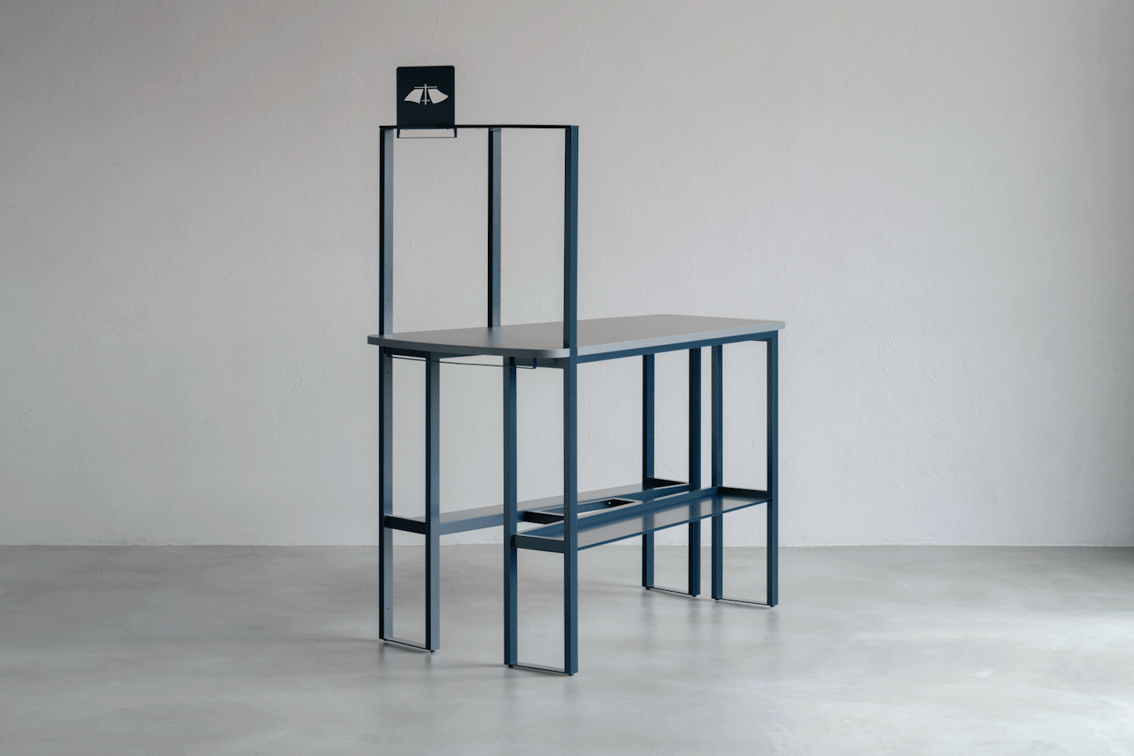
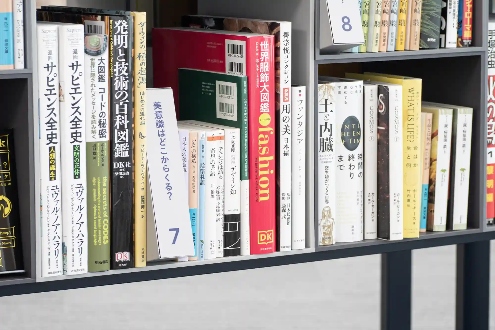
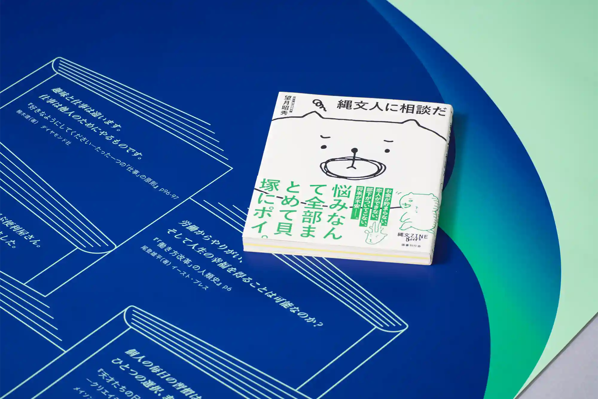
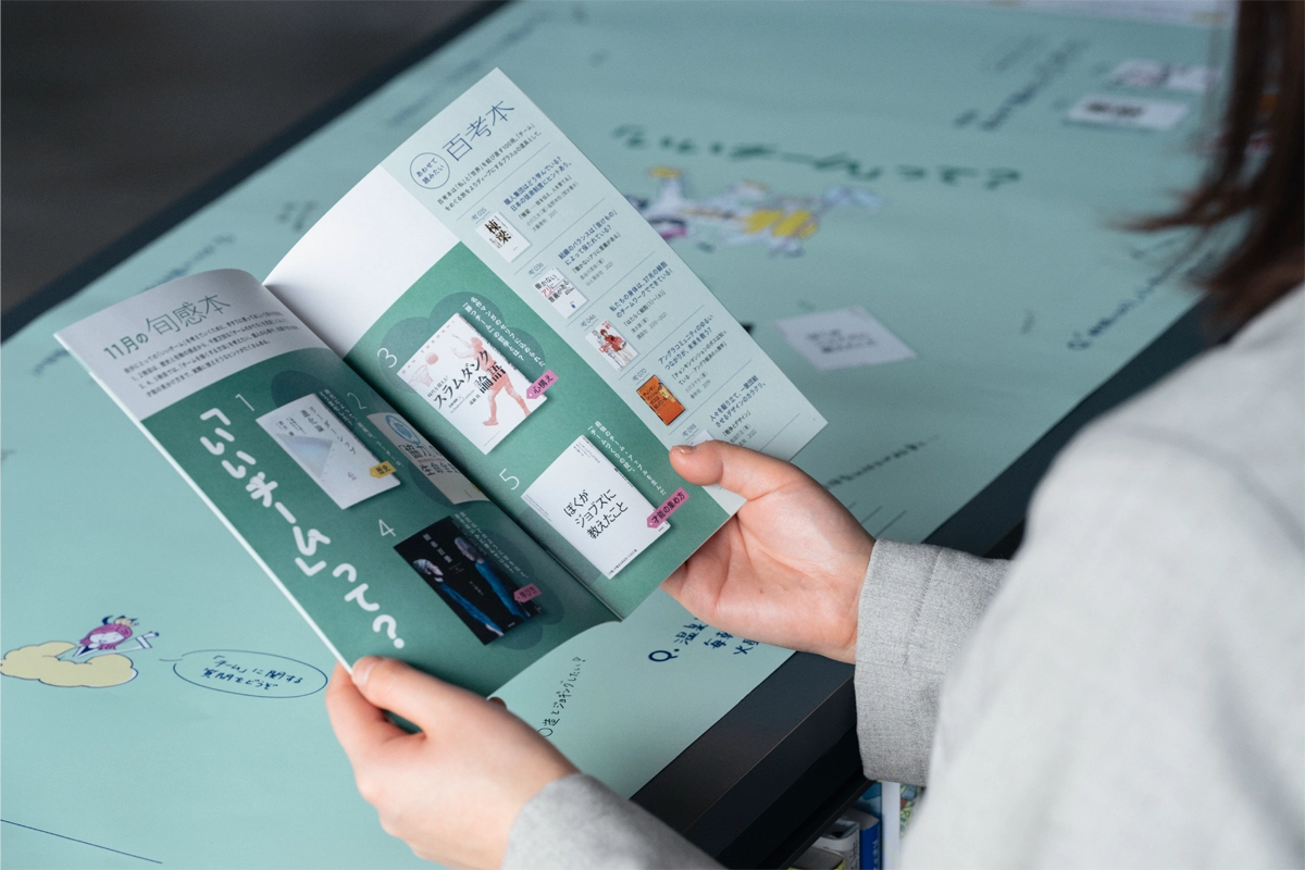
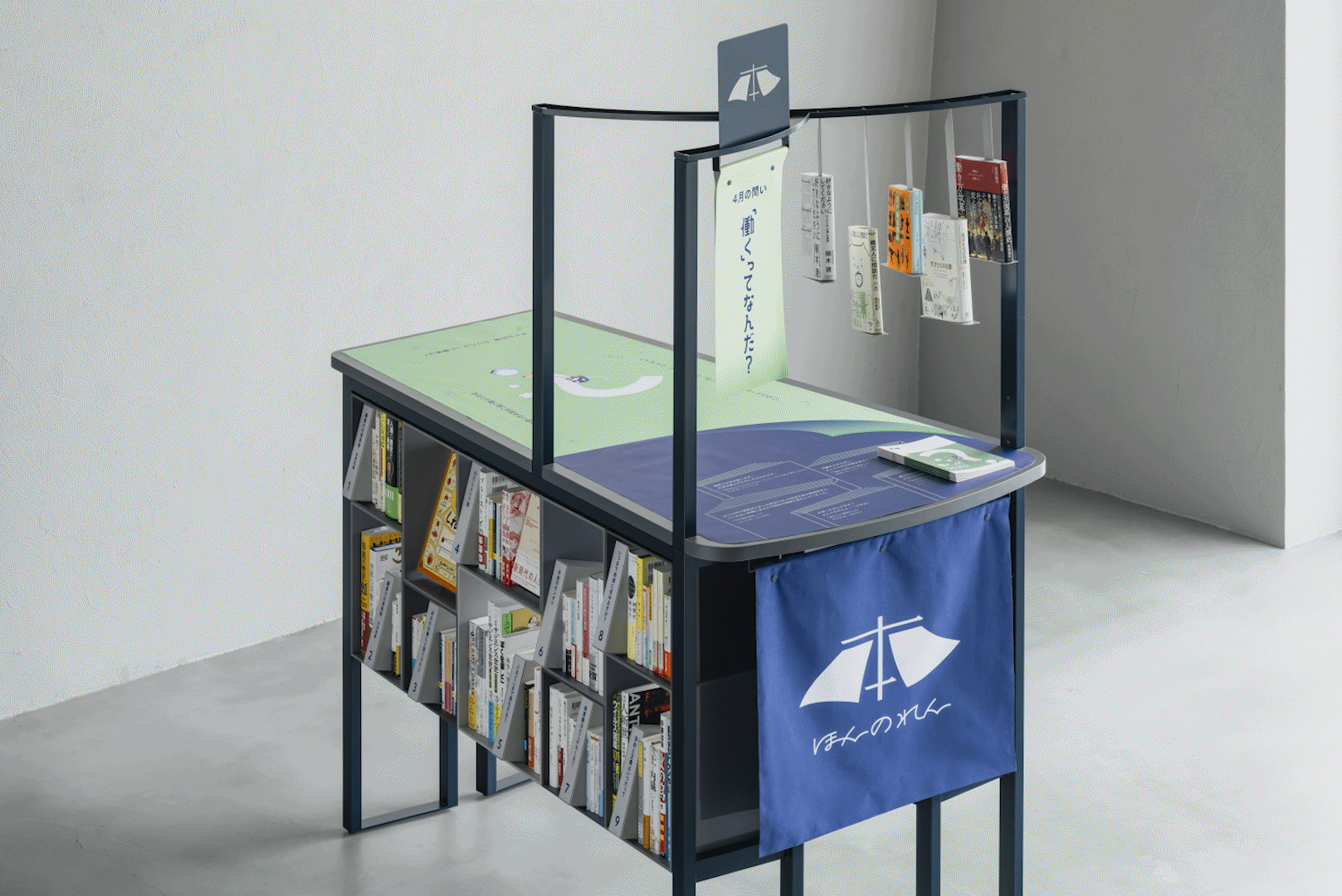
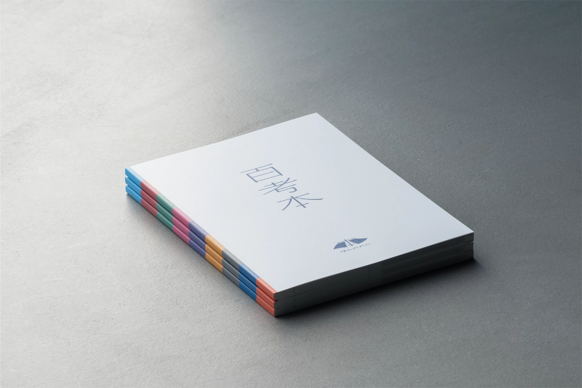
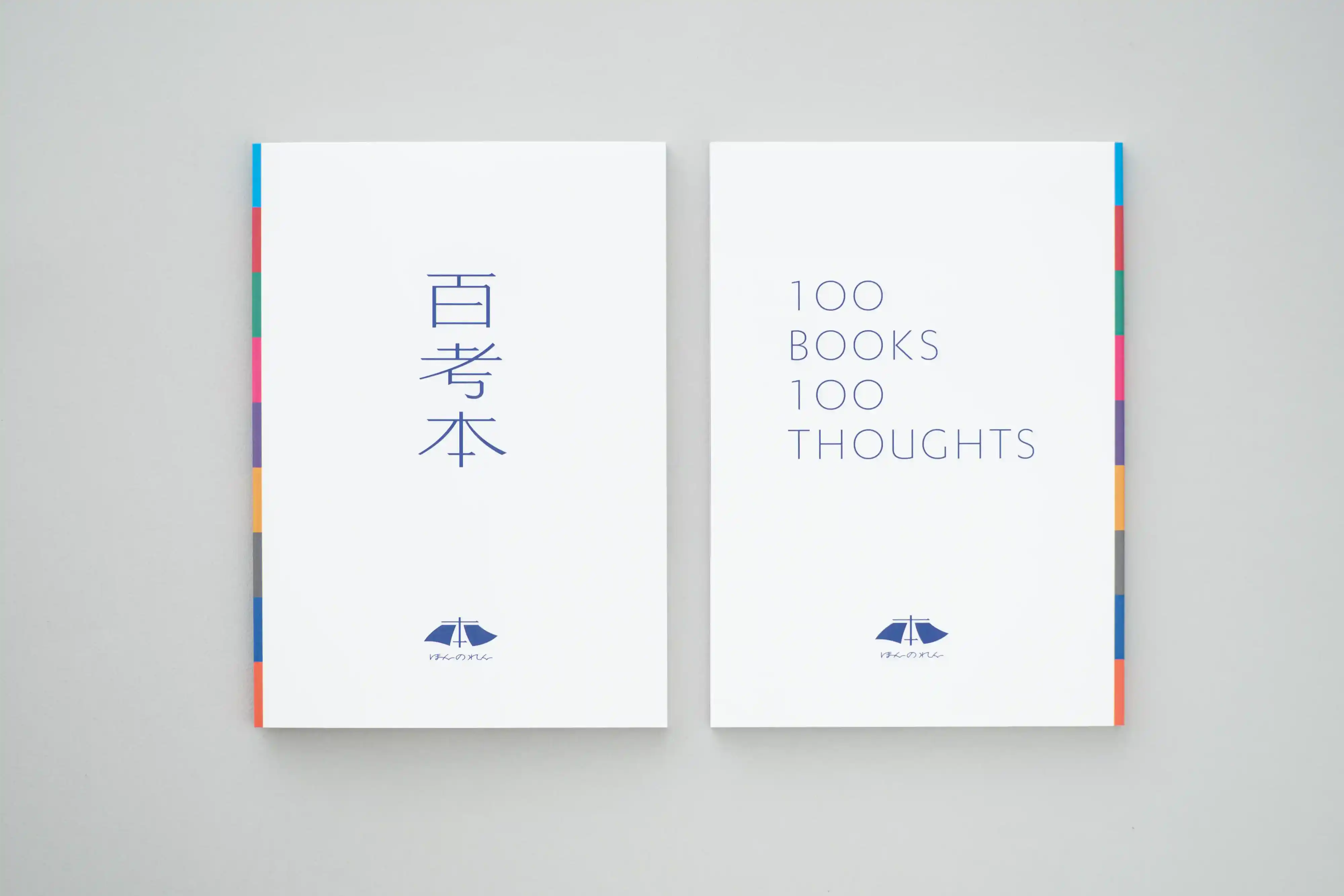
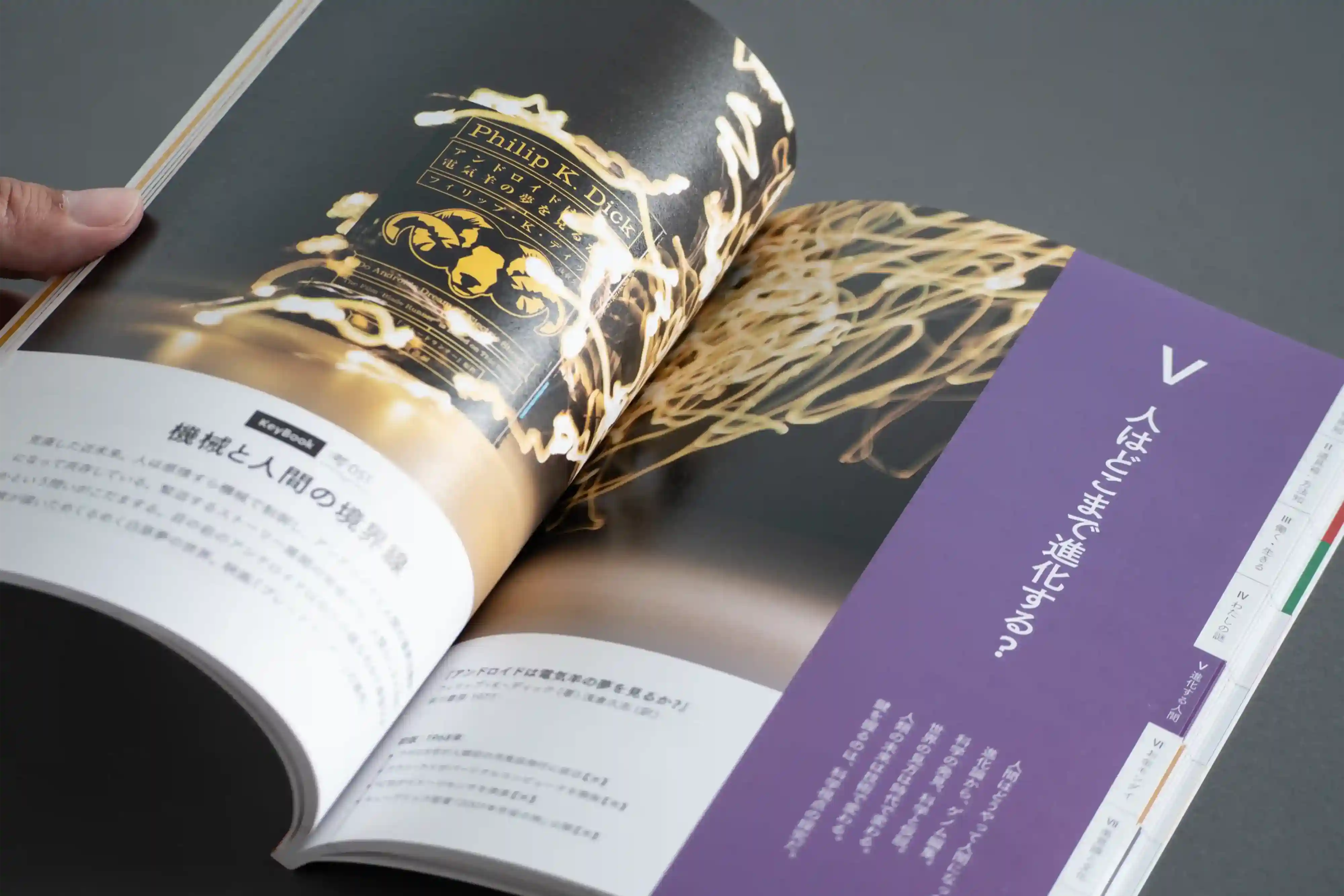
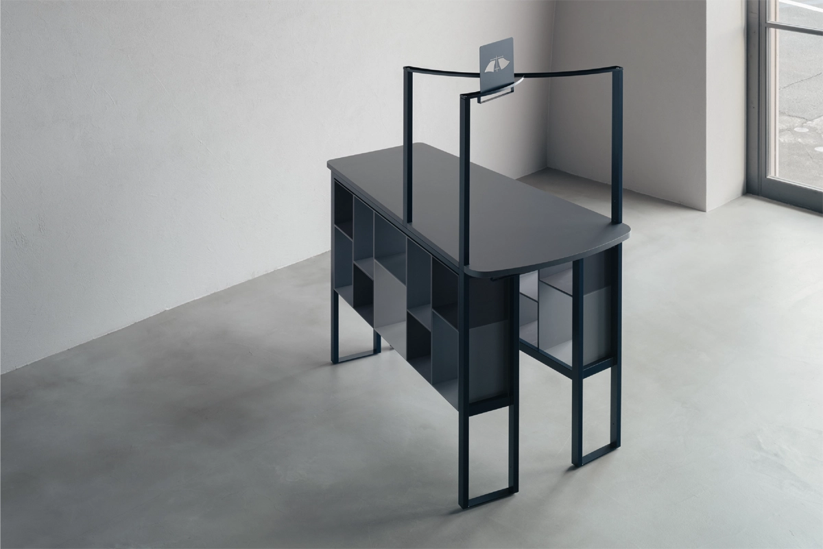
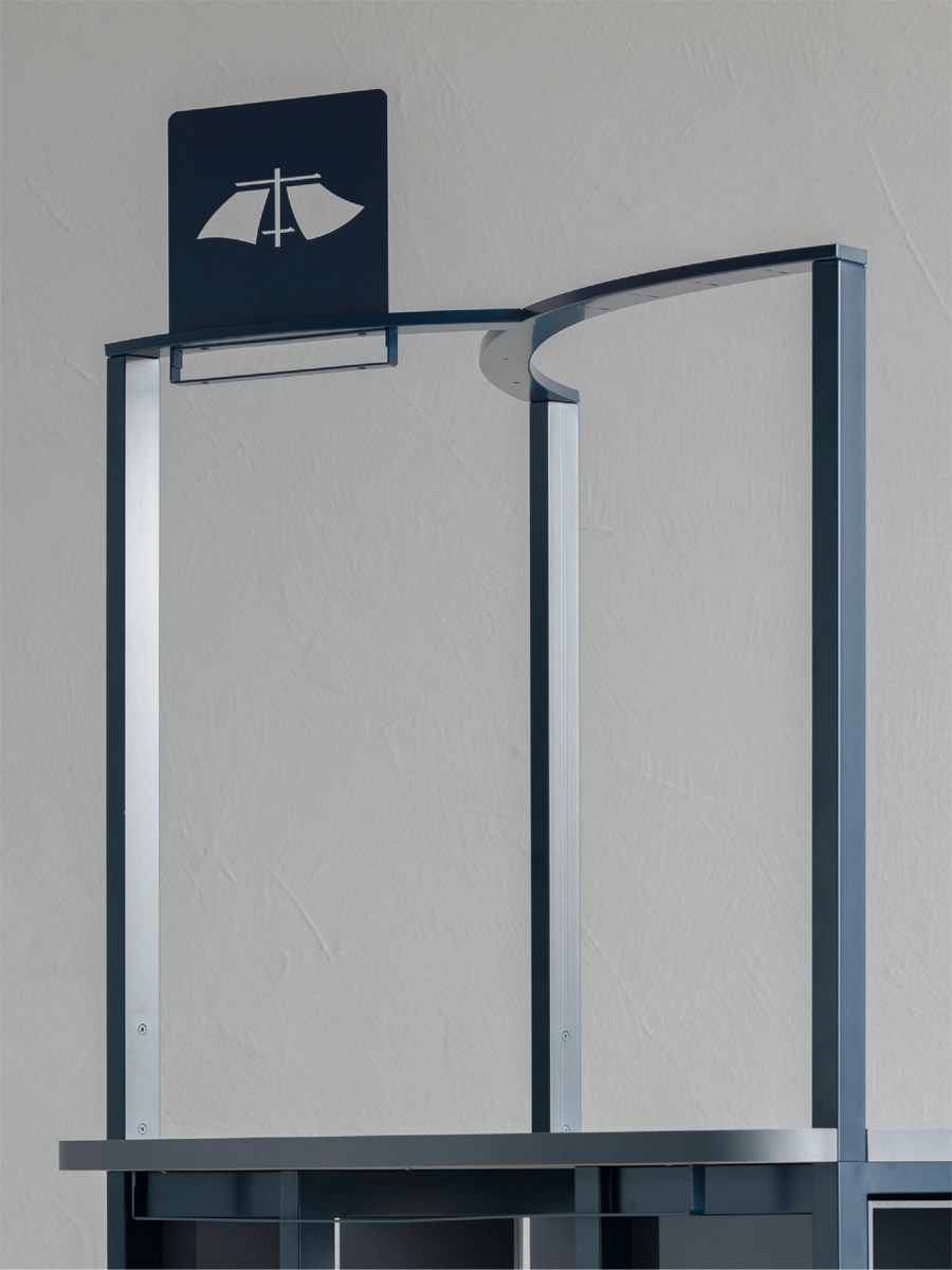
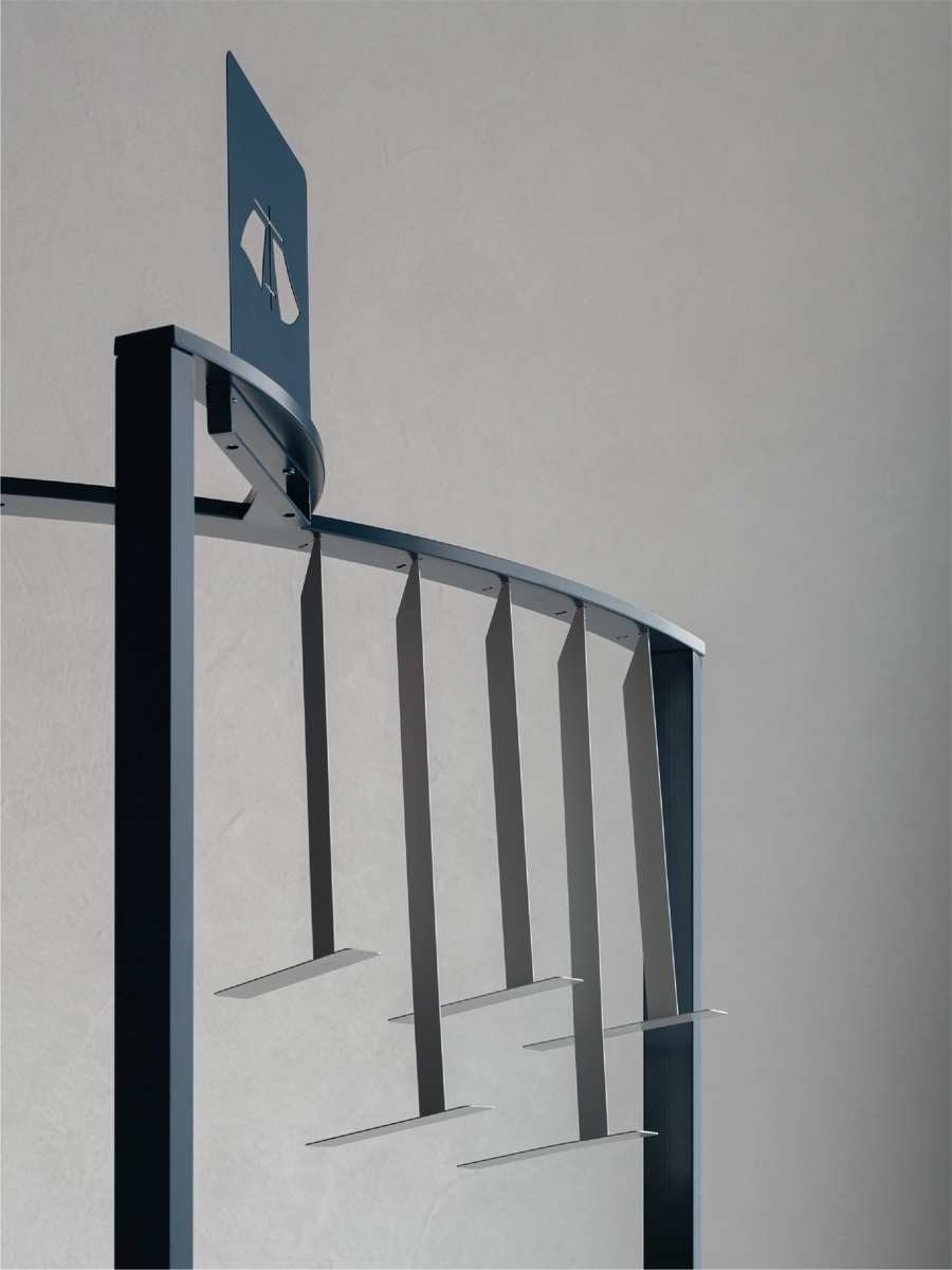
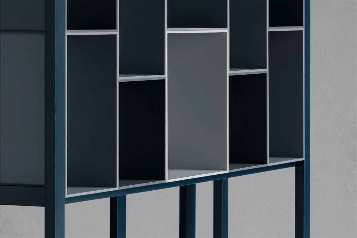
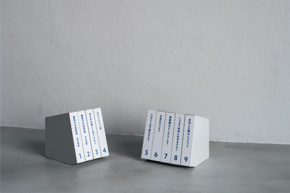
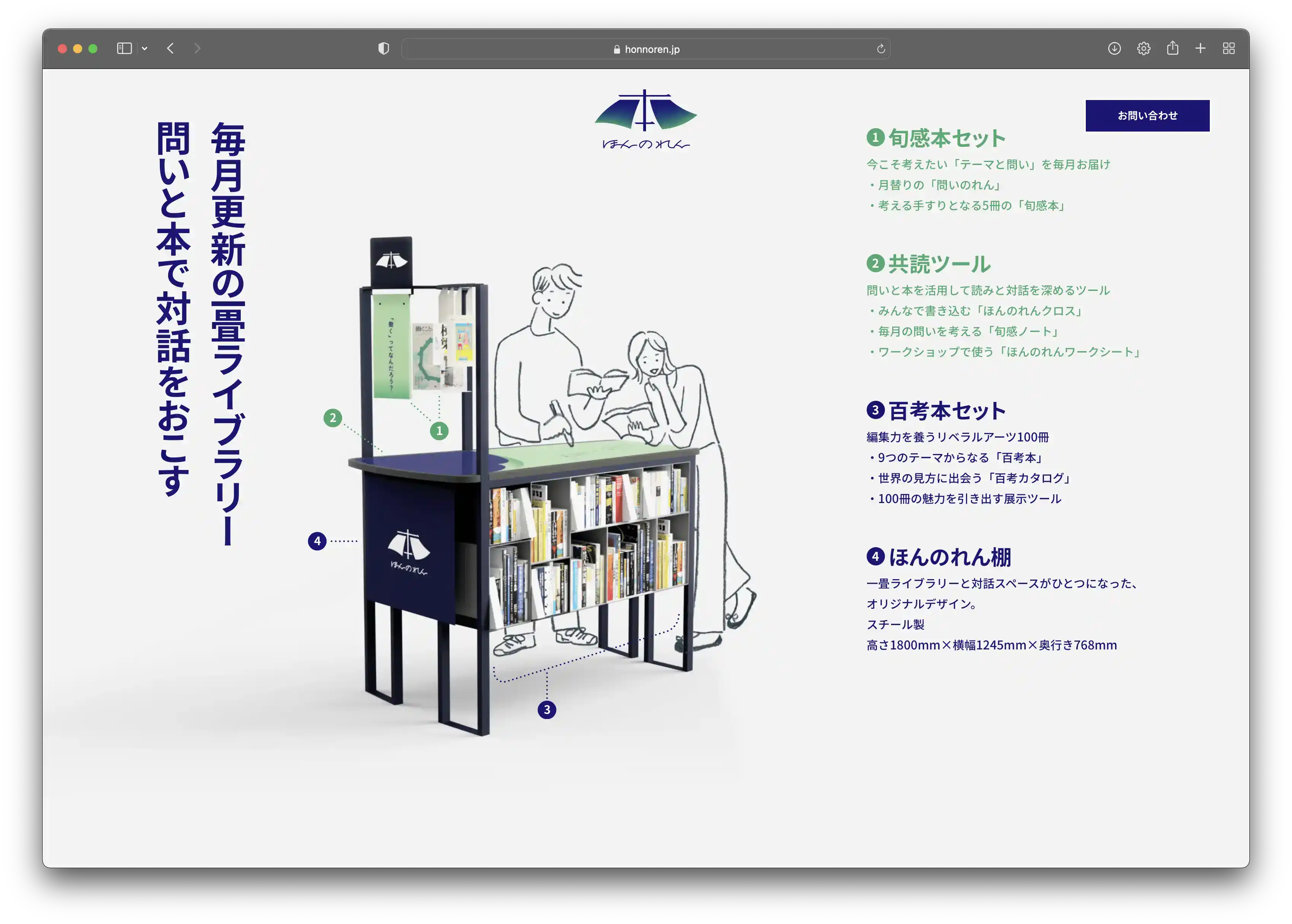
「ほんのれん」は、会社や学校、地域施設の中で、コミュニケーションのハブとなる装置です。一畳サイズの本棚には、リベラルアーツ100冊の「百考本」と、対話を促すテーブルが備えられています。今考えたい旬な「問い」と一緒に毎月届く5冊の「旬感本」は、のれんのようにかけることで、アイキャッチとして機能します。テーブル上の「ほんのれんクロス」は、「対話」と「問い」によって変化していく利用者の考えを、書き込むことができ、次の誰かの新しい思考を刺激します。「ほんのれん」は、「本の連」でもあり、江戸時代に文化を次々と生み出した経済文化サロン「連(れん)」のような創造力とネットワークを、組織や場の垣根をこえてつくりだします。ロゴマークは「本」の漢字をベースに、「百考本」と「旬感本」を表した2枚ののれんを加えた造形です。そこからプロモーションツール、カタログ、本棚、毎月のグラフィックツールまでトータルでデザインを行いました。
The " hon no ren " is a device that serves as a communication hub within a company, school, or community facility. A bookshelf the size of a tatami mat is equipped with 100 "Hyakkou-Bon Books" of liberal arts and a table that encourages dialogue. Five "Shunkan-Bon Books" delivered monthly with seasonal "questions" to think about now can be hung like a Noren and function as an eye-catcher. The "Hon no ren Cloth" on the table allows users to write their thoughts, which change through the "dialogue" and "questions," and stimulate someone else's new thoughts. The " hon no ren " is also a "book link," creating creativity and networks that transcend the boundaries of organizations and places, like the economic and cultural salons "Ren" that produced culture one after another in the Edo period. The logo mark is based on the Chinese character for "book," and is formed by adding two brick walls representing "Hyakkou-Bon Books" and "Shunkan-Bon Books". From there, we designed the total package, including promotional tools, catalogs, bookshelves, and monthly graphic tools.

Year : 2023
Category : Branding (Logo, Promotional Tools, Web Site, Product, Books, Monthly Design)
Client : 株式会社 編集工学研究所
Illustration : 須山 奈津希
Coding : THREE Inc.
https://honnoren.jp/